What the old site hid
The old site buried iDesign.Market’s connected workflow for quotes, orders, site updates and payments. I redesigned twelve pages, keeping the brand, customers and published pricing.
One job: book demos
For this self-initiated redesign, I wanted the owner of a 20-person firm to understand iDesign.Market on a phone and book a demo.
The audit
I reviewed five key pages on desktop and mobile, checking their copy, first impressions and trust signals.
First impression
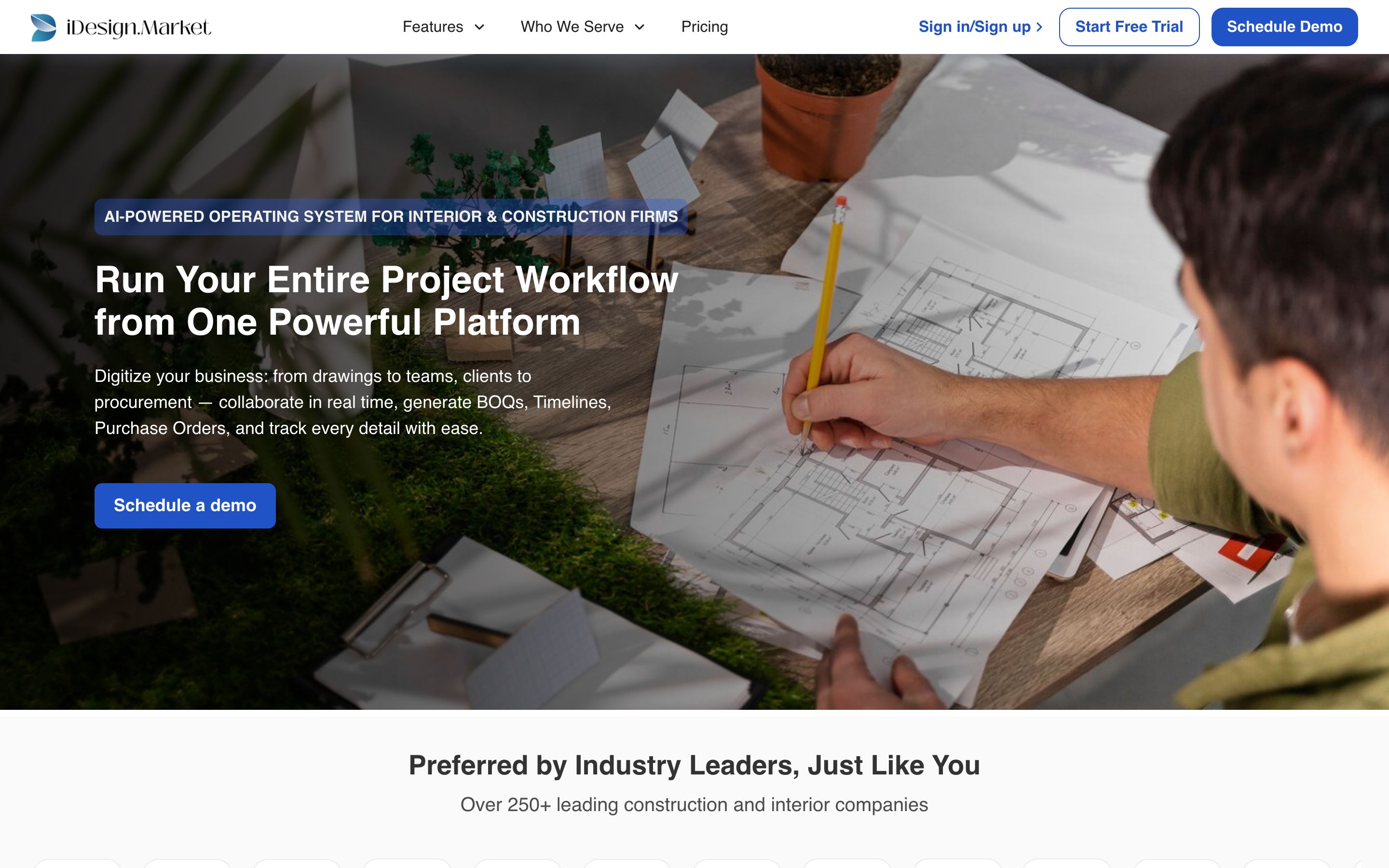
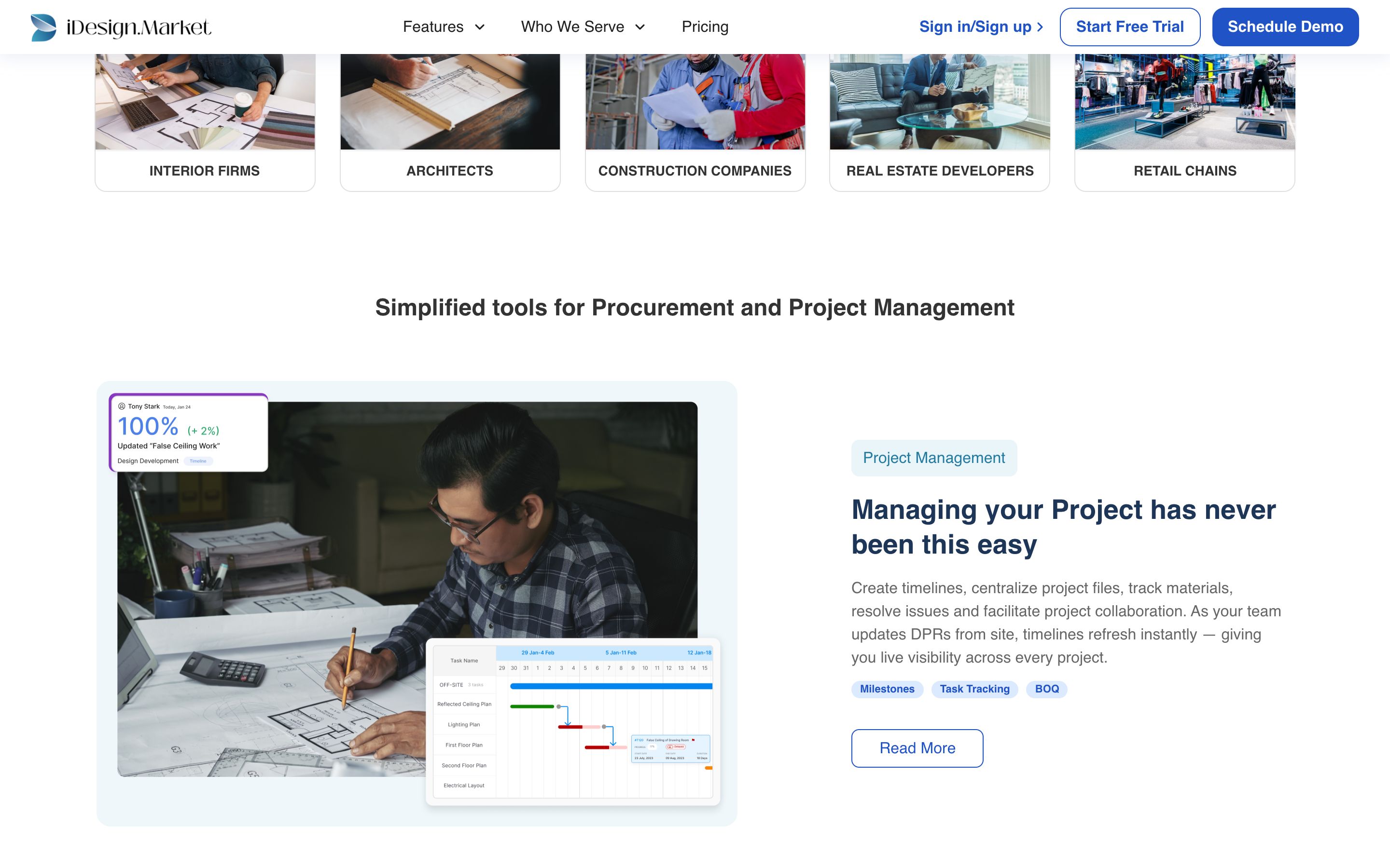
- The headline, “Run Your Entire Project Workflow from One Powerful Platform”, could describe any project tool. Procore, Powerplay and Studio Designer make the same claim in different words.
- “AI-powered operating system” is the first thing you read, but nothing on the page says what the AI does. An AI claim with nothing behind it makes a firm owner trust the page less.
- The idea that sets iDesign apart, BOQ → Material Indent → Purchase Orders → Update Delivery → Inventory → Vendor Payments, appears only once, as a line of text inside the second feature block.
Language
Across the five pages I reviewed, “streamline” appears 21 times, “seamless” or “seamlessly” 16 times and “effortless” 7 times. The features page alone uses “seamless” 11 times in 832 words.
Trust
This was the most serious finding. A B2B buyer is deciding whether to trust a vendor, and these mistakes make that harder.
| Issue | Where |
|---|---|
| The same testimonial text is credited to different people | “Game-changer” quote: Harshal (Rekha Interiors) on the homepage, Austin Knight (Cradle Design) on the interior-firms page. “Very user-friendly” quote: Julian Brown on features, Mayank Aggarwal on interior firms. |
| Two FAQ answers are identical, word for word | “How is iDesign different…” and “How is iDesign Pro different from Procore…” |
| Two phone numbers and two email addresses | +91-9953921073 / +91 8920 614 255; support@ / info@ |
| Copy errors | “Company Managemnt”, “Design.Market is the all-in-one…”, “Interior & Project Managements”, “Personalized Customizations” listed twice |
| A feature description copied from another feature | “Native Mobile App” repeats the Team Management text |
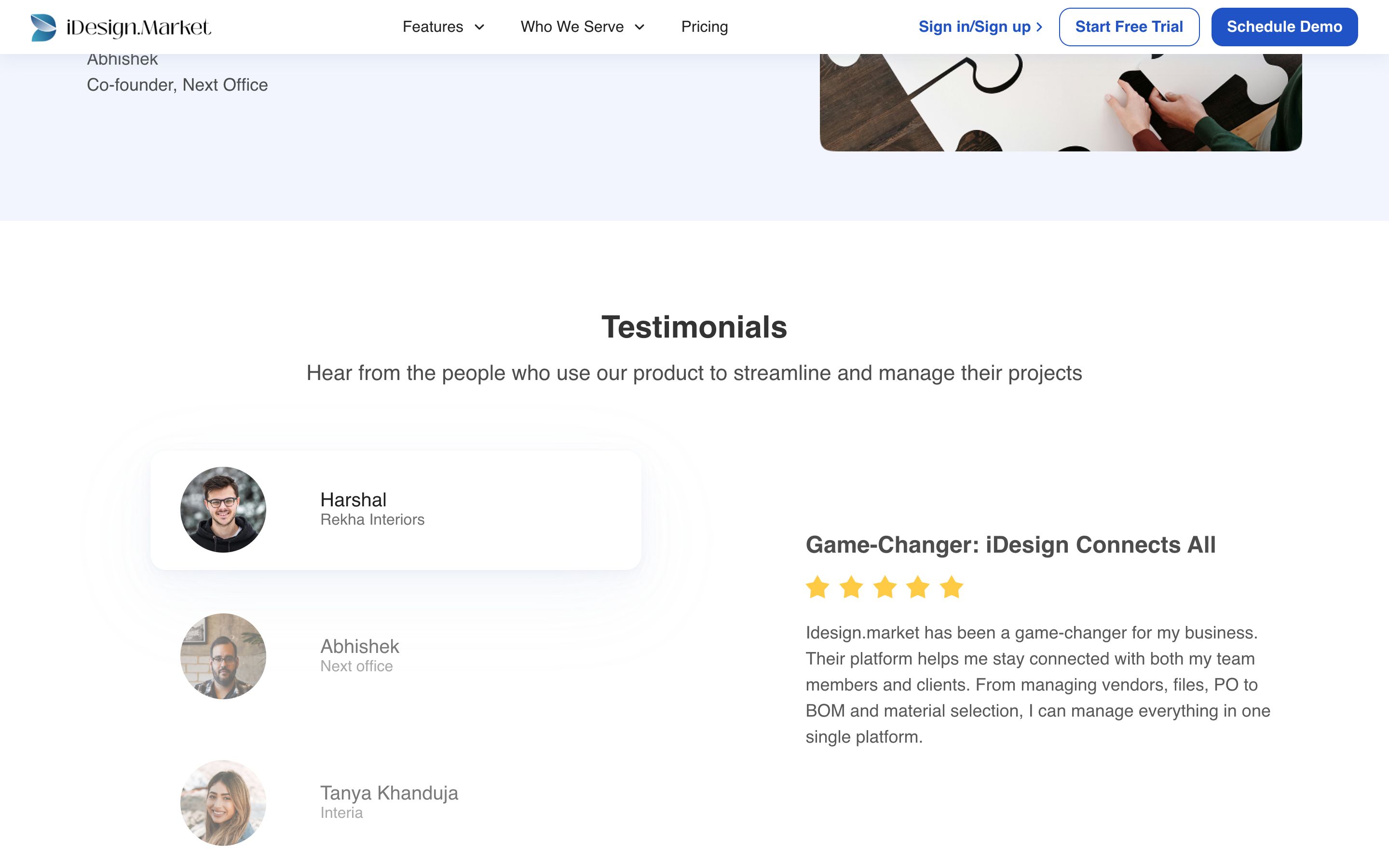
A firm owner who spots one of these has a reason to doubt the rest of the page.
The sub-pages
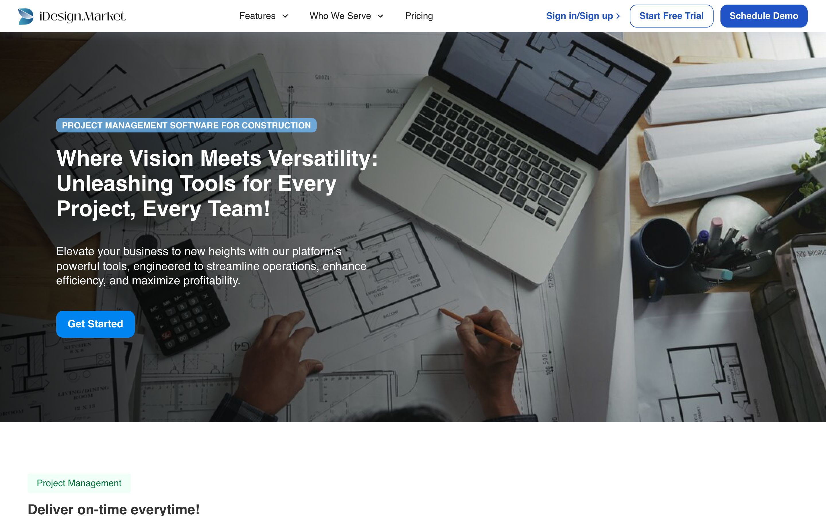
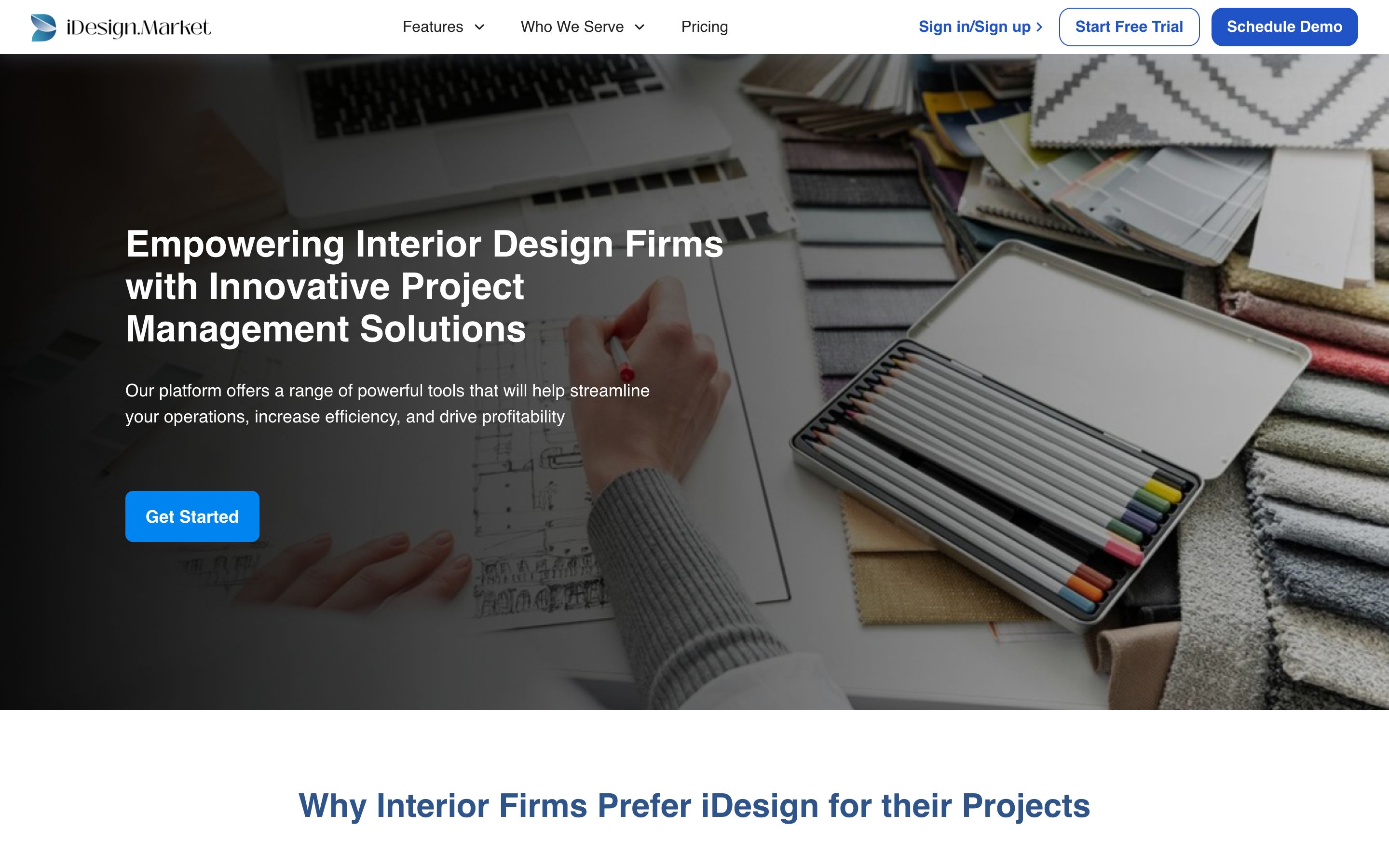
- All five industry pages share the same subhead, word for word: “Our platform offers a range of powerful tools that will help streamline your operations, increase efficiency, and drive profitability.” Only the verb in the headline changes: Empowering, Transforming or Revolutionizing.
- The architects page lists its tools under the heading “An Array of Essential Tools Interior Firms Prefer”.
- Every industry page shows the same three testimonials, including the two quotes credited to different people elsewhere on the site.
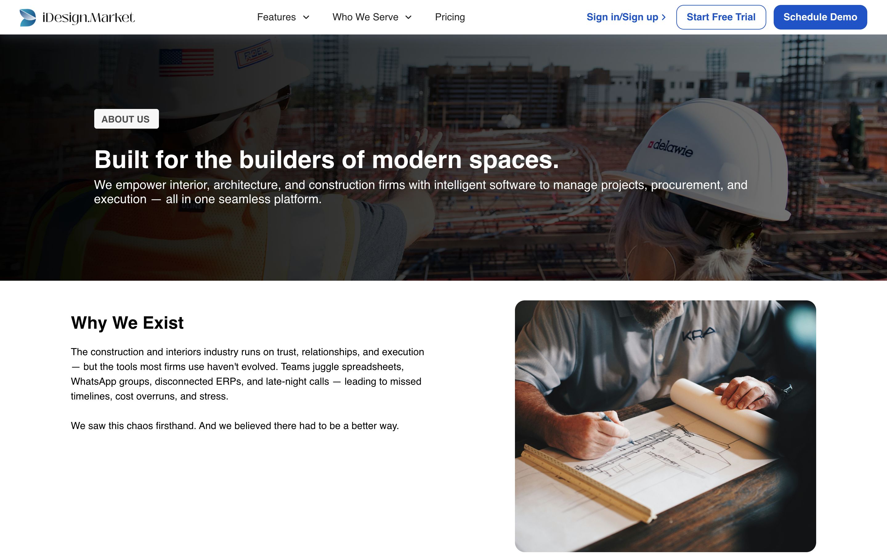
- The About page’s stock hero, with a US flag and another company’s branding, sits on the site of a company serving India, the UAE, Australia and New Zealand.
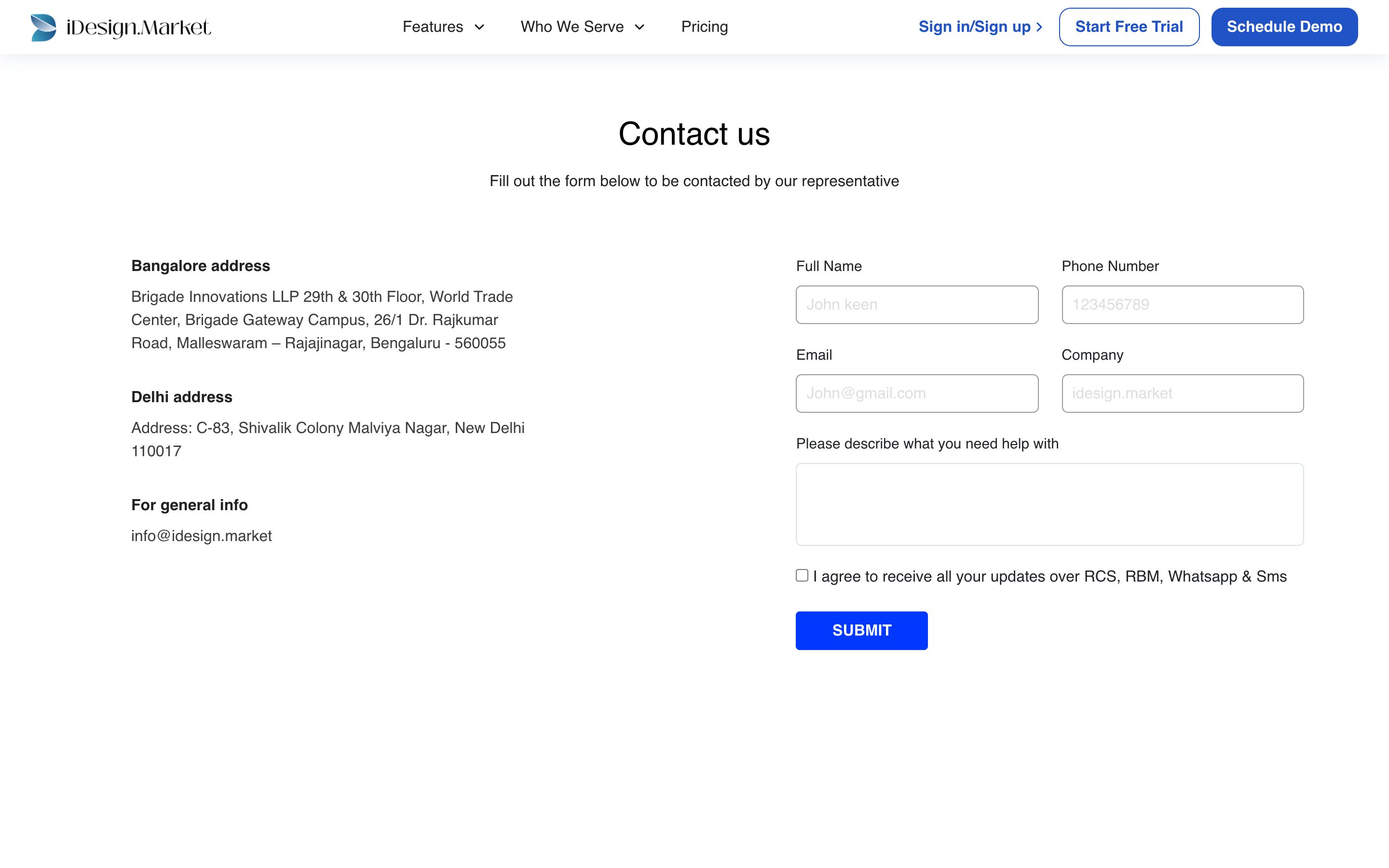
- The contact page lists two office addresses and one general email, but no phone number, and the form has no way to say what you need help with.
- The footer’s “T&C” link goes to
/cookie-policy, which holds the Terms & Conditions. There is no separate cookie policy; cookies are covered only in section 5 of the privacy policy. - The privacy policy’s “Terms of Use” link points to
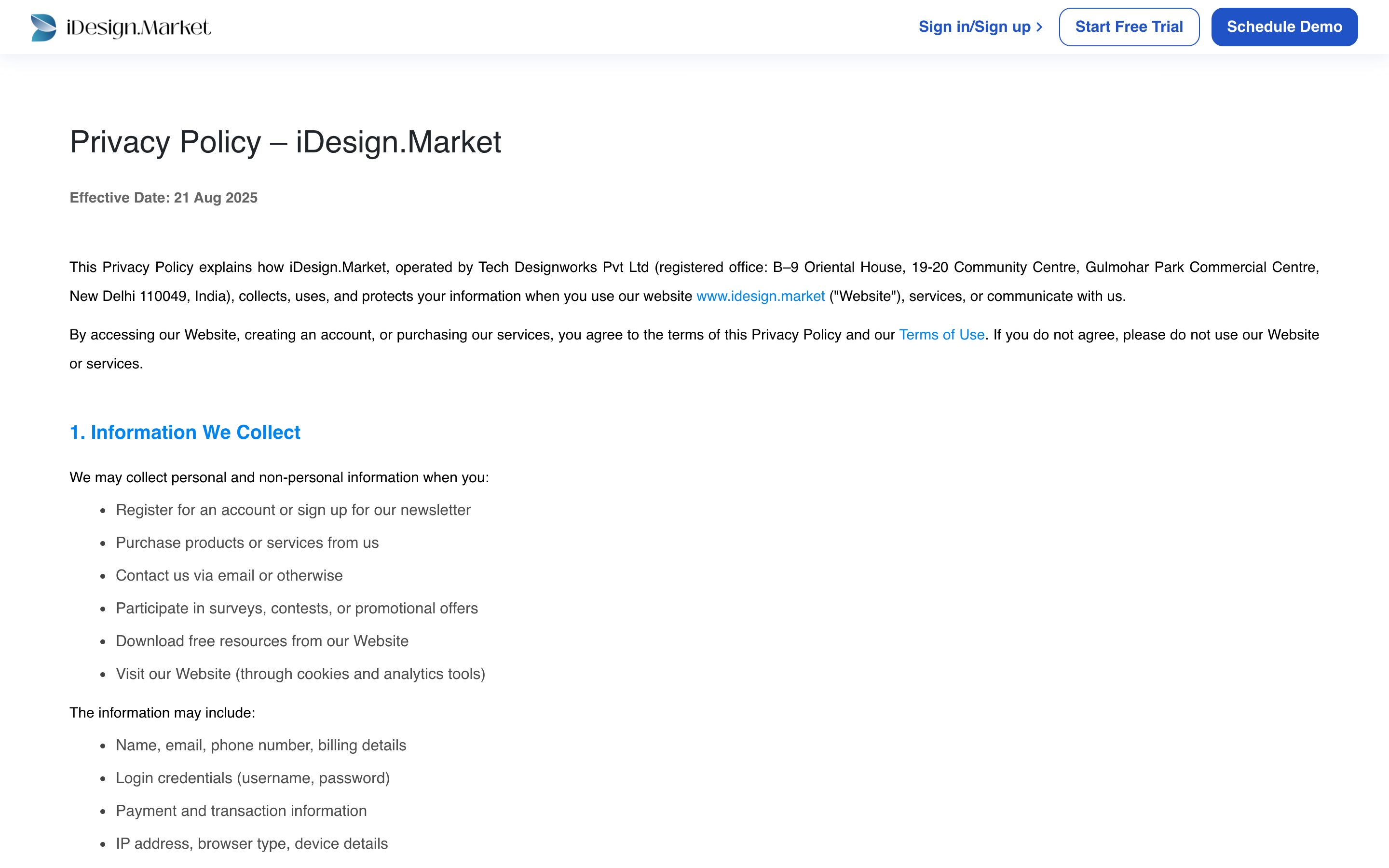
/terms-and-conditions, which loads a blank page. - The privacy policy is set in fully justified text with no table of contents across ten sections, and its header drops the main navigation.
What was already working
iDesign.Market publishes its pricing, which most competitors don’t. It has recognisable customers (Ambience, NextOffice, ANJ, Gallant, AKDesigno) and real quotes from them, five clearly defined industries and a working mobile app. I kept all of them and made them easier to find.
The firm owner
I designed for firm owners and principals, typically leading teams of 5–100, while accounting for the people who use the product day to day.
| Who | What they need to see | What it means for the page |
|---|---|---|
| Owner / principal | Control over margin, cash and delays. Proof that peers use it. | Lead with the business outcome; show money in the first screen; customer logos immediately after. |
| Project head | Timelines, site updates, fewer follow-up calls. | Show the timeline and the site app clearly, with real-looking data. |
| Purchase & accounts | POs, deliveries, vendor payments in one place. | Give procurement its own tab, with a real PO table. |
| Their clients | Updates and approvals without chasing. | Show the client portal and the approval moment. |
Working assumptions. These profiles come from iDesign’s own positioning, its five published segments, its about page (“teams juggle spreadsheets, WhatsApp groups, disconnected ERPs, and late-night calls”) and what its customers say in their quotes. I recommend confirming them in 5–8 short customer interviews before launch.
Design principles that came out of this
- Say it plainly. One idea per section and one headline per idea.
- Show the product. Every product claim sits next to a screen that shows it working.
- Show their world. Photos of finished spaces and real sites instead of office stock and abstract gradients.
- Use their words. BOQ, indent, GRN, DPR and running bill are the documents they already work with.
- One next step. Booking a demo is the main action on every page.
Competitors
I compared the homepages of competitors named in iDesign’s FAQ, plus Powerplay, an Indian player.
| Company | Headline (October 2026) | What it signals |
|---|---|---|
| Procore | “Together, we can build it all” | Scale, enterprise general contractors, AI agents |
| Studio Designer | “The Leading Business Platform for the Interior Design Industry” | Residential interior designers, organised by role |
| Powerplay | “Simplify Your Construction Management!” | Mobile-first site, material and labour tracking |
| iDesign.Market (old) | “Run Your Entire Project Workflow from One Powerful Platform” | All-in-one and AI, the same claim as everyone else |
The homepages lead with broad promises. I wanted to show the connections that matter to iDesign’s customers: client approval, a purchase order, a site report and the matching payment.
The direction: show one project moving through the system.
iDesign also had three advantages the old site wasn’t using. It publishes its pricing in rupees, it uses the industry’s own document names, and it serves firms that both design and build, which none of the global players focus on.
Familiar B2B conventions
Owners often see the site on a phone, between site visits. So I used the layouts of established B2B software sites, which they already know how to read.
What the direction is
- A plain promise in the headline, with no metaphor to decode
- Generous white space and one idea per section
- Large photography of the customer’s own world
- Product screens that explain themselves, with realistic project data
- One call to action, repeated: book a demo
What it avoids
- Abstract gradients, 3D blobs and decorative illustration
- Unexplained AI claims and category buzzwords
- Dense, information-packed screens
- Motion for its own sake
- Layouts that need explaining
For this audience, a premium feel comes from aligned type, consistent spacing and real numbers. Every page uses one connected record for each project, realistic project data (the same marble floor, PO-0381 and 24.3% margin wherever the product appears) and the industry’s own vocabulary.
In the industry’s words
The positioning line, the message hierarchy and the rewritten headlines.
Positioning
For interior and construction firms that design and build, iDesign.Market is the one system for quotations, purchasing, site progress and payments, so the owner always knows where every project and every rupee stands.
Message hierarchy
| Level | Message |
|---|---|
| Promise | Run every project from one place. |
| Proof of need | When quotes, orders and site updates live in different places. |
| Pillar 1: Project | Plan, track and deliver on time. |
| Pillar 2: Cost | Protect your margin on every purchase. |
| Pillar 3: Client | Win more work and keep clients informed. |
| Proof | 250+ firms, four countries, named customers, their own words, press, public pricing. |
| Action | Book a free demo. |
Tone of voice
- Be specific. “Every purchase tied to the budget” instead of “maximise profitability”.
- Use the trade’s words. BOQ, indent, GRN, daily progress report, running bill. If a site supervisor wouldn’t say it, it isn’t on the site.
- Talk about outcomes. Time saved, margin protected, fewer calls and fewer surprises.
- Keep it short. Short sentences in the active voice, one idea each.
- A banned list. Seamless, streamline, effortless, elevate, empower, revolutionise, game-changing (unless a customer says it), and any AI claim the product can’t demonstrate on the page.
Before and after
| Element | Before | After |
|---|---|---|
| Eyebrow | AI-powered operating system for interior & construction firms | Project management for interior & construction firms |
| Headline | Run Your Entire Project Workflow from One Powerful Platform | Run every project from one place. |
| Subhead | Digitize your business: from drawings to teams, clients to procurement — collaborate in real time, generate BOQs, Timelines, Purchase Orders, and track every detail with ease. | Quotations, purchases, site progress and payments in one system, so you always know where every project and every rupee stands. |
| Project feature | Managing your Project has never been this easy | Plan, track and deliver on time |
| Cost feature | Efficiently manage your finances, save cost & earn profit | Protect your margin on every purchase |
| Client feature | Stay ahead of the competition, nurture your clients | Win more work and keep clients informed |
| Pricing | Affordable & adaptable pricing to suit your goals | Simple pricing that grows with your team. |
| Closing CTA | Experience Seamless Interior & Project Managements | See iDesign.Market in action. |
I also dropped “AI-powered” from the lead. If iDesign wants to talk about AI, it should be one concrete feature, shown working, on the product pages.
Ordered by the buyer’s questions
I reordered the homepage around the questions a firm owner asks before booking a demo.
| # | Section | The question it answers |
|---|---|---|
| 1 | Hero | What is this, and is it for me? |
| 2 | Customer logos | Do firms like mine use it? |
| 3 | The problem | Do they understand how my business actually breaks? |
| 4 | Platform tabs | What does it do, and what does it look like? |
| 5 | How it works | How does it fit into a project, start to finish? |
| 6 | Customer story | Has it worked for someone I could call? |
| 7 | Industries | Does it fit my kind of firm? |
| 8 | Mobile app | Will my site team actually use it? |
| 9 | Testimonials & press | What do others say? |
| 10 | Pricing | What will it cost me? |
| 11 | FAQ | What about integrations, setup, payment? |
| 12 | Demo form | How do I see it working? |
I removed two sections. The “Join us on mobile” block merged into the mobile-app section. The repeated FAQ, which appeared on every page with the same four questions, became one rewritten FAQ with six different answers.
Site map
The other pages work the same way: each has one job, and each ends with the same action.
| Old page | New page | Its job |
|---|---|---|
| Features | Product | Show everything the platform does, area by area, with the product on screen |
| Pricing | Pricing | Let a buyer work out their own price without a call |
| Who we serve (×5) | Five industry pages | Prove the product fits this particular kind of firm |
| About | About | Show who is behind the company and why to trust them |
| Contact | Contact | Route every enquiry to the right team, fast |
| Privacy policy | Privacy Policy | Make the policy easy to read, navigate and print |
| “Cookie policy” (holds the T&C) | Terms & Conditions | Publish the terms under their real name, with working links |
The header is the same on every page: Product (an overview plus the four product areas), Solutions (the five industries), Pricing, Customers and Company, with “Book a demo” always visible.
A plain visual system
One type family, blue for actions, and real photography.
Typography
I use one family, Figtree, from 400 to 700. It stays readable at small sizes and on low-cost Android phones, which much of this audience uses, and sets compactly at headline sizes. With a single family, the photography and product screens carry the personality. Headlines are bold with tight tracking (−0.03em); body copy is 17–20px with a 1.6 line height for comfortable reading on mobile.
Colour
I kept iDesign’s blue, refined slightly for contrast (6.9:1 against white). Changing a brand colour on a marketing redesign creates friction with the product, the app icon and sales material, for no gain to the buyer. What I changed is how it’s used: blue now means “action” and nothing else. Navy carries depth for the customer-story band and footer. A warm neutral sits behind interior photography. A cool neutral sits behind product screens so the UI reads as software. Status colours (green, amber) appear only inside the product, the way they do in the app.
Photography
These firms do good-looking work, so the site shows it: finished spaces and people at work, such as a completed reception, materials in hand, engineers on site, a tower under construction and a fitted store, all in natural light. No posed handshakes or laptops on white desks. In this prototype I used licence-free Unsplash photos as stand-ins. At launch they should be replaced with photos of iDesign customers’ real projects.
Product screens
The old site showed the product as small cards floating over stock photos. I show it large and readable, with realistic project data: a fit-out timeline, a PO table with delivery status, a client approval. The screens animate to show cause and effect: bars fill, an approval resolves. Before launch they should be checked against the live product so nothing is promised that the app doesn’t do.
Shape, icons and grid
- Grid: 1240px container, 12 columns, 24px gutters; sections have 80–136px vertical padding.
- Corners: 8px on buttons and inputs, 12–20px on cards, 28px on large photographs.
- Icons: one line-icon set (Lucide), one stroke weight, always inside a soft blue tile so they read as a system.
- Depth: two shadow levels, resting and lifted, with the second used for hover.
The homepage, top to bottom
What each homepage section does, and why.
Navigation
What I did
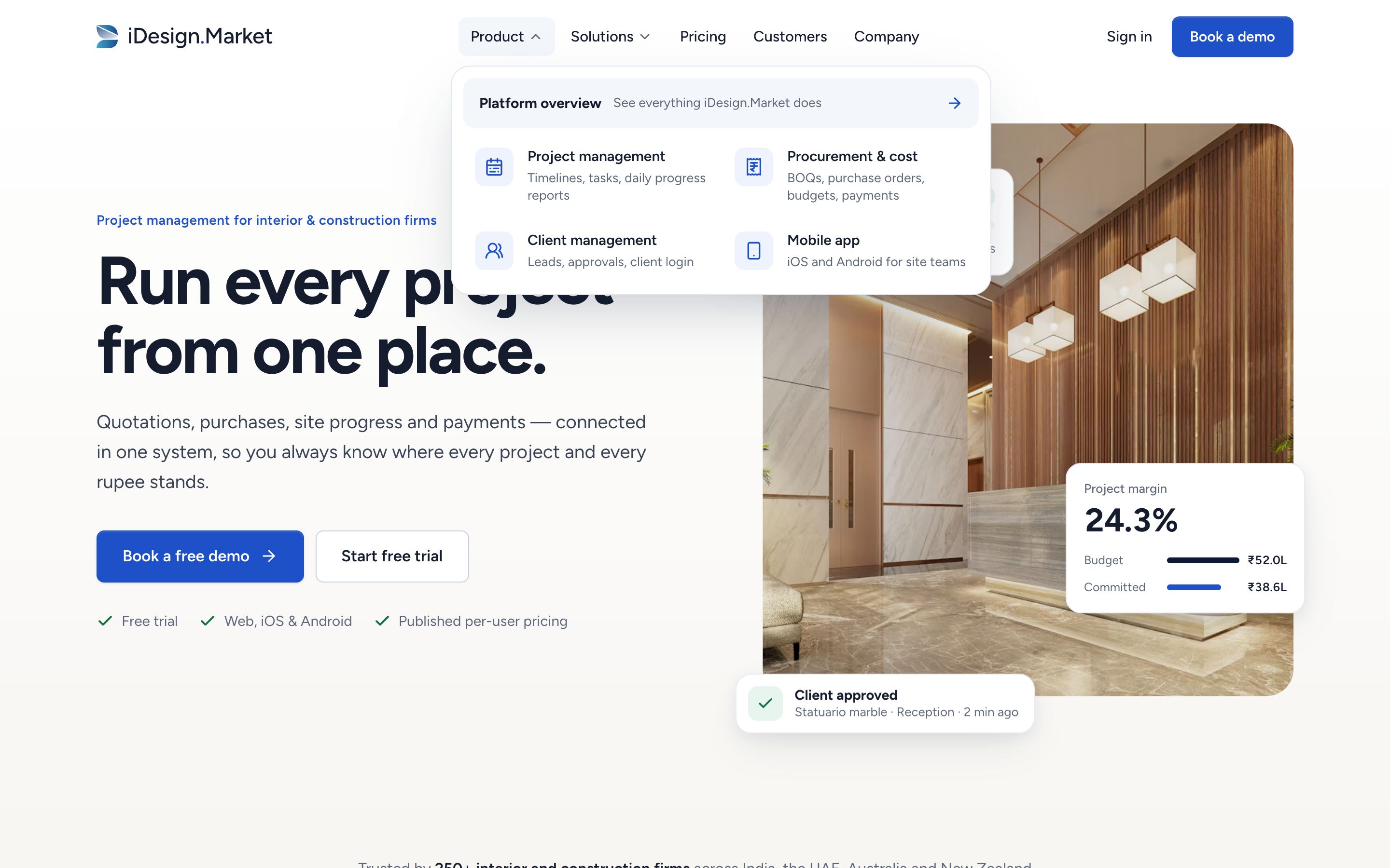
- Product and Solutions dropdowns, each item with an icon and a one-line description
- “Book a demo” always visible in the header
- Header gains a soft shadow only once you scroll
- Full-screen menu with grouped sections on mobile
Why
- Descriptions help visitors self-select without guessing what “Additional Benefits” means
- The demo is the main action, so it stays in view
- Dropdowns open on hover, click and keyboard, and close with Esc
Hero
What I did
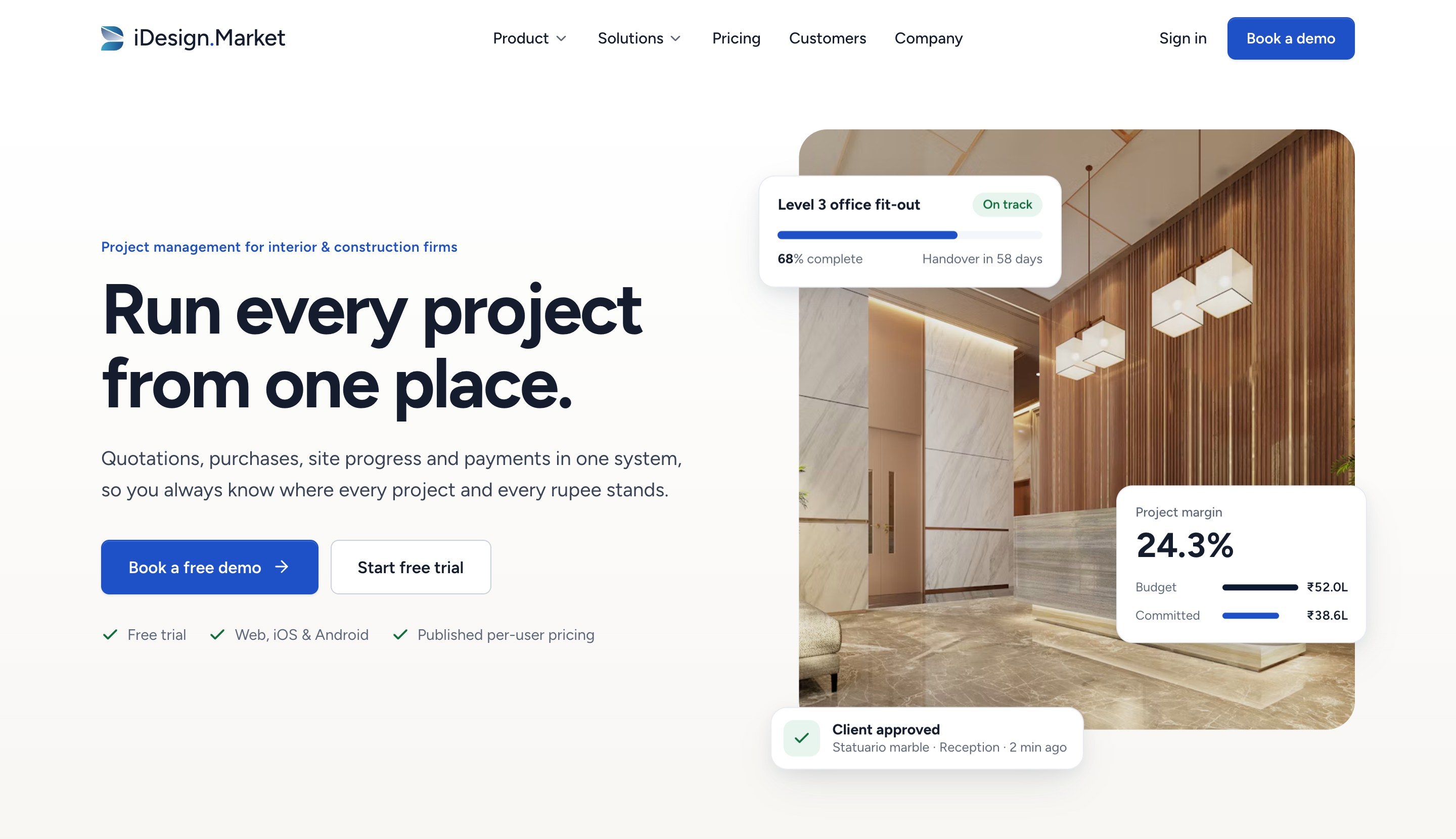
- A seven-word headline that says what the product does
- A subhead naming the four things it connects, ending on money
- Two actions: free demo (primary) and free trial (secondary)
- Three reassurance points: free trial, web and mobile apps, published pricing
- A photo of a finished reception, the result of a real fit-out, with three product cards: project health, margin and a client approval
Why
- Owners decide quickly whether to keep reading, so the promise has to be plain
- The three cards show the three pillars (project, cost, client) before any explanation
- The marble reception ties to the product data used throughout the page, so the story is consistent
Customer logos
What I did
- “Trusted by 250+ interior and construction firms across India, the UAE, Australia and New Zealand”
- iDesign’s real customer logos in a slow, continuous row; greyscale, coloured on hover; pauses on hover
Why
- This buyer trusts what other firms use, so the logos come right after the promise
- Naming the four markets tells an Australian or UAE firm the product isn’t India-only
- Greyscale stops eleven brand colours from clashing with the page
The problem
What I did
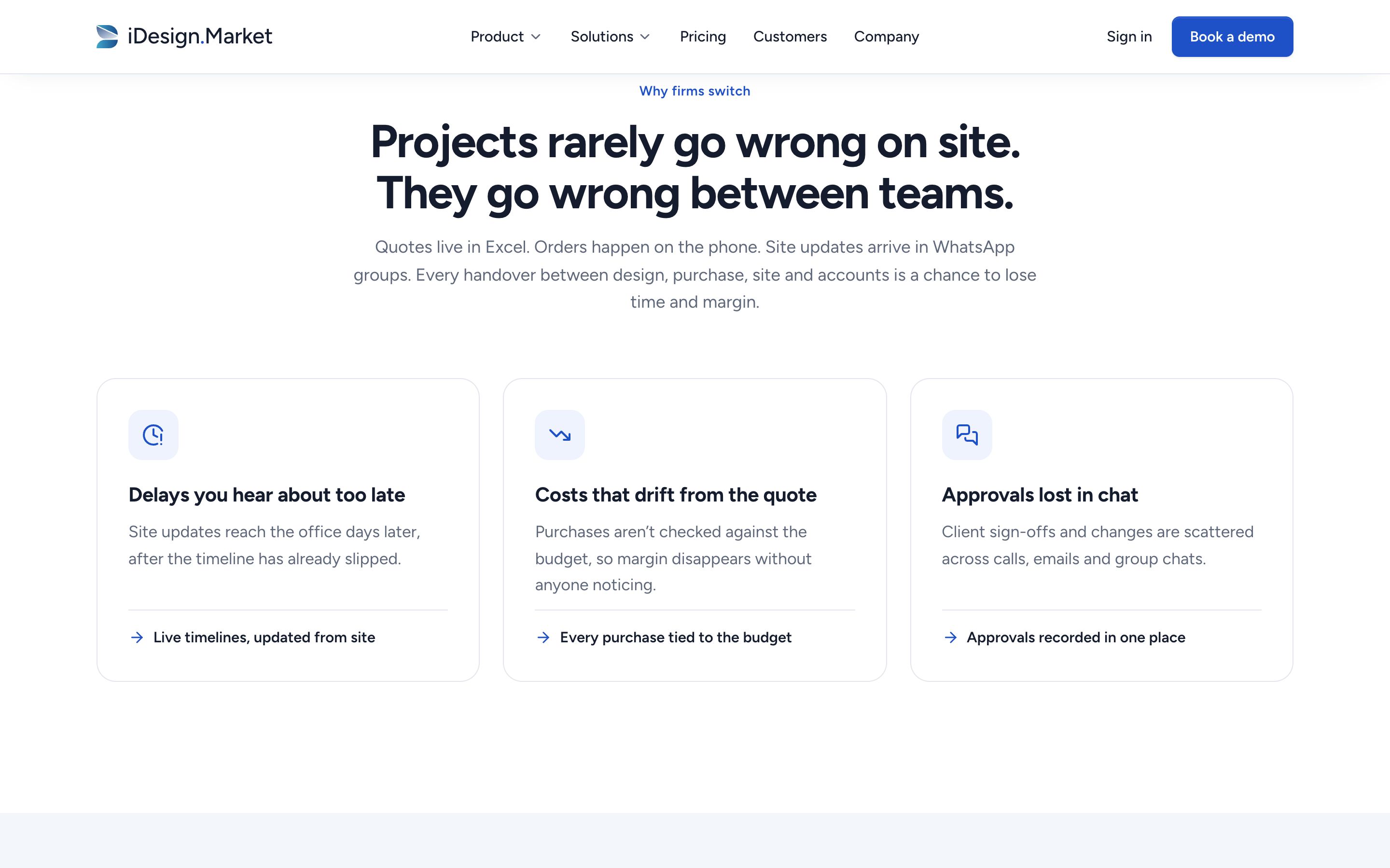
- “When quotes, orders and site updates live in different places.”
- Three pains, each paired with the fix in one line
Why
- Naming the problem in the owner’s terms (Excel, phone orders, WhatsApp groups) shows iDesign understands their business before selling to it
- Each pain has its fix beside it, which leads into the product tabs
Platform tabs
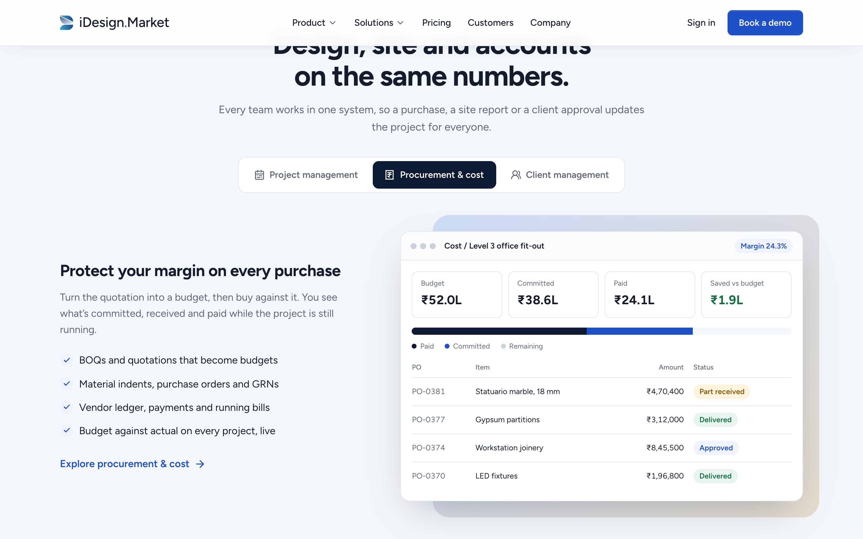
What I did
- Three tabs (Project, Procurement & cost, Client) replacing three long alternating blocks
- Each tab: one benefit headline, two sentences, four specifics, and a large product screen
- Screens animate when shown: bars fill, budget splits into paid and committed, a client approval resolves to “Approved”
Why
- Tabs let visitors go straight to what they care about without a long scroll
- The small animations show cause and effect, which is what “connected” means in practice
- Full keyboard support: arrow keys, Home and End
How it works
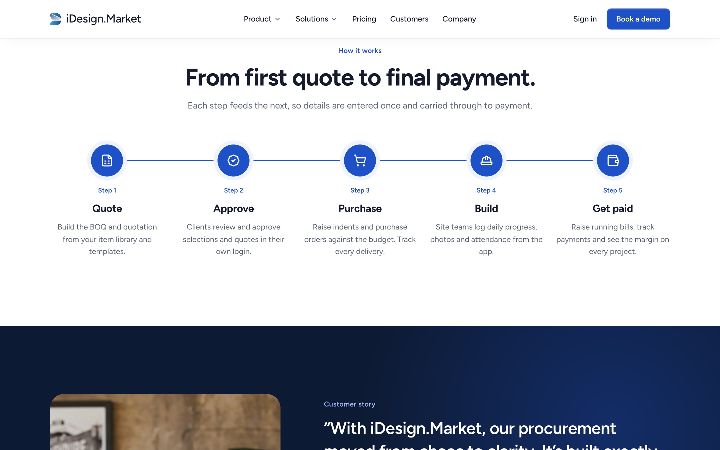
What I did
- Five steps from first quote to final payment, one sentence each
- A connecting line fills as you scroll; each step lights up as it’s reached
Why
- This turns the buried “BOQ → Indent → PO…” line from the old site into the clearest visual on the page
- The verbs (quote, approve, purchase, build, get paid) are the owner’s own project lifecycle
Customer story
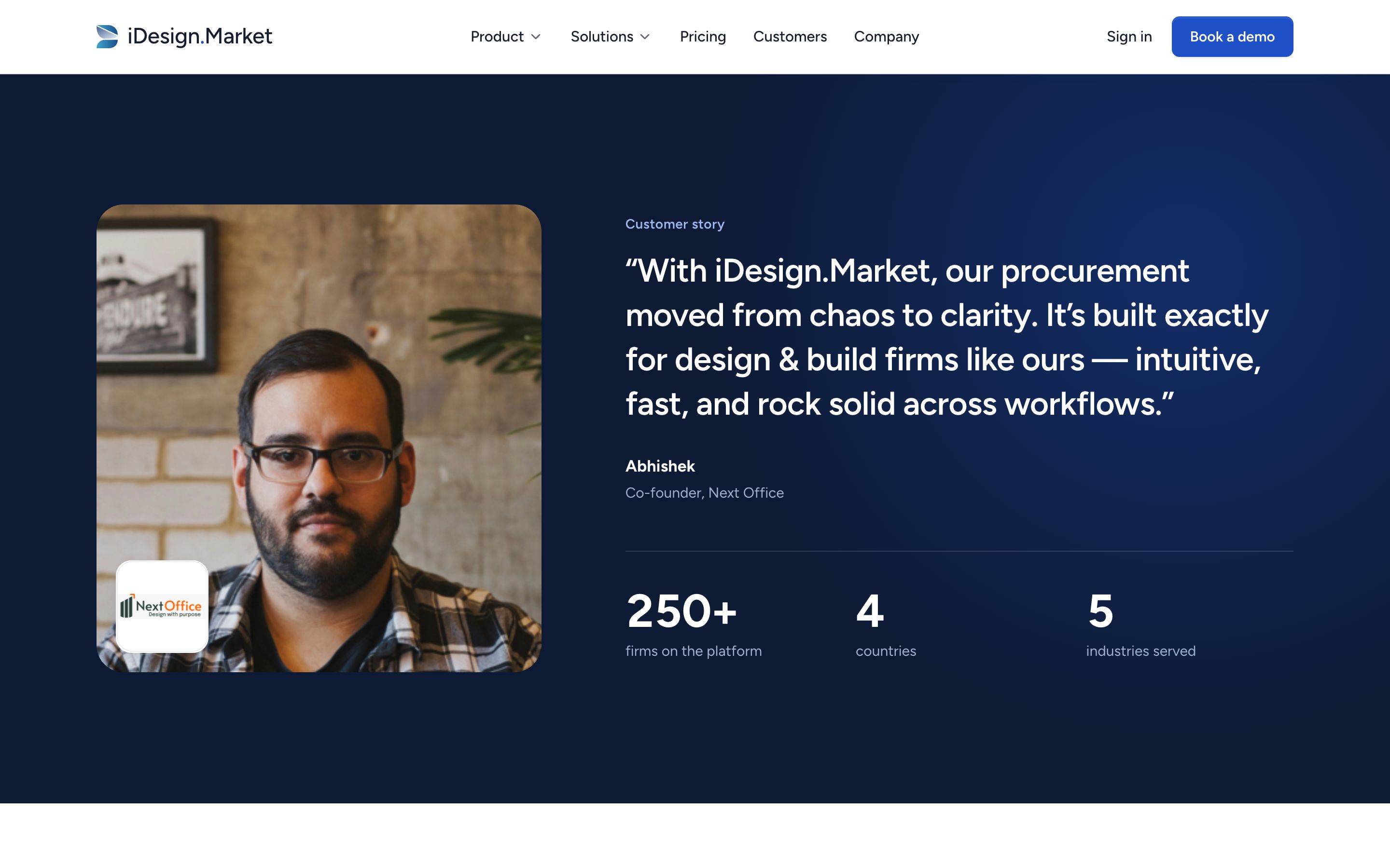
What I did
- One customer, given real space: photo, company logo, quote, name and role
- Three facts underneath: 250+ firms, 4 countries, 5 industries
- The only dark section in the middle of the page
Why
- A named person with a photo and a role is easier to check, and so to believe, than a carousel of short quotes
- The darker band marks a change of voice: this part is the customer speaking
- Every fact here is one iDesign already publishes
Industries
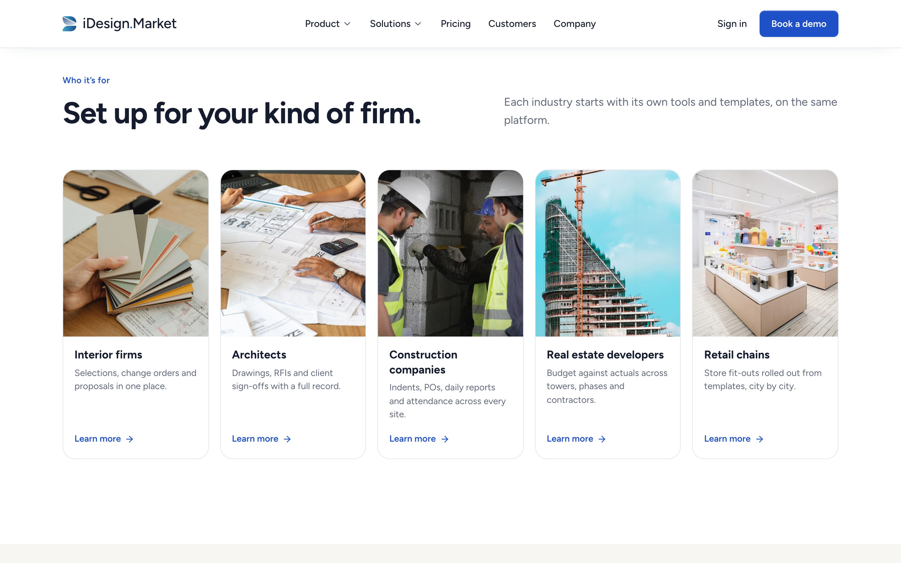
What I did
- Five photo cards, one per industry, each with a single specific line and a link to its page
- Horizontal swipe on tablet and mobile
Why
- Visitors look for their own kind of firm, and a photo is quicker to recognise than a label
- Each line names that industry’s specific job (selections, RFIs, multi-site, phases, roll-outs)
Mobile app
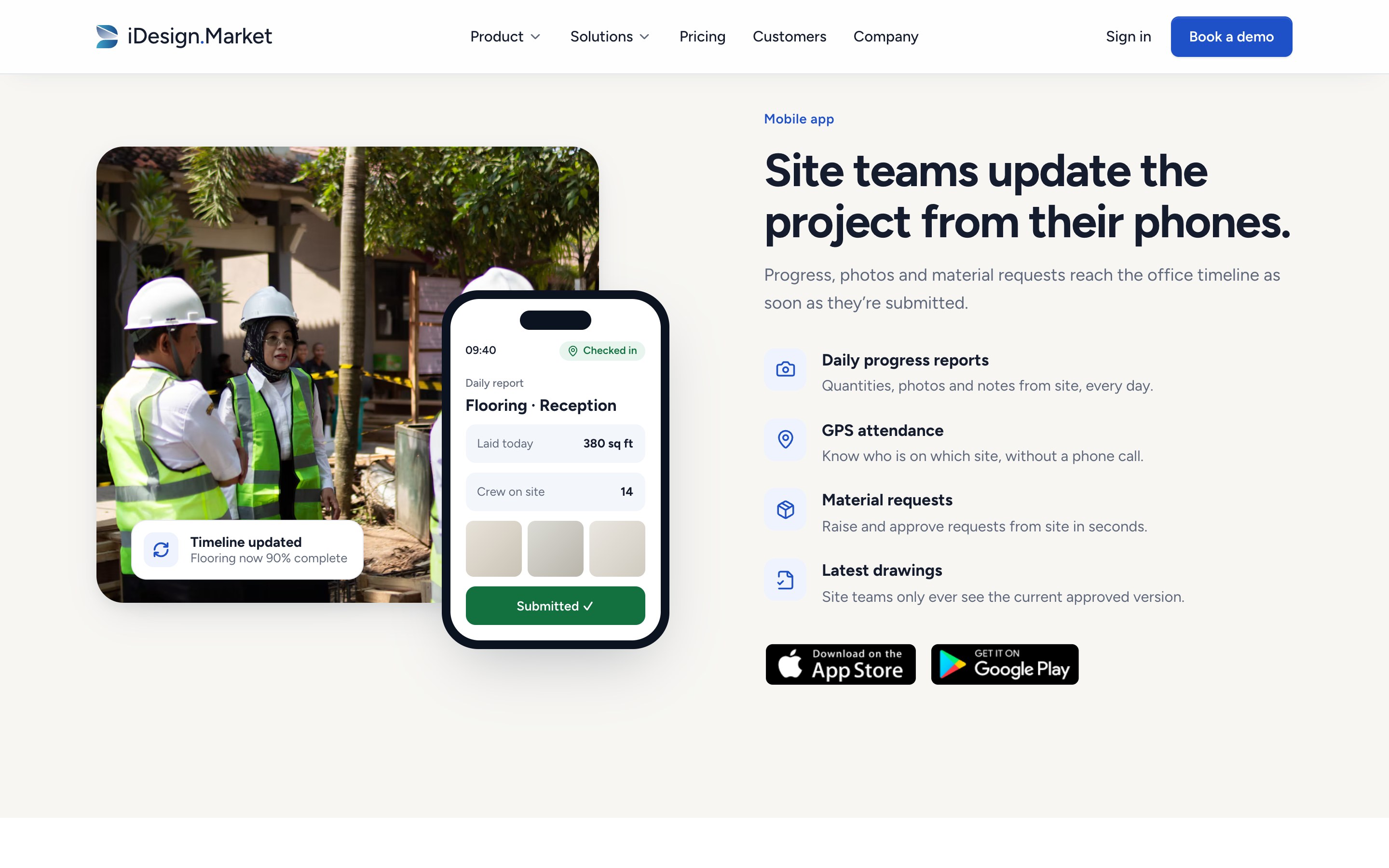
What I did
- “Site teams update the project from their phones.”
- A phone submitting a daily report; moments later, “Timeline updated” appears
- Four concrete capabilities and the real store badges
Why
- An owner needs to know the site team will actually use it
- The two-step animation shows the site-to-office link without extra copy
Testimonials and press
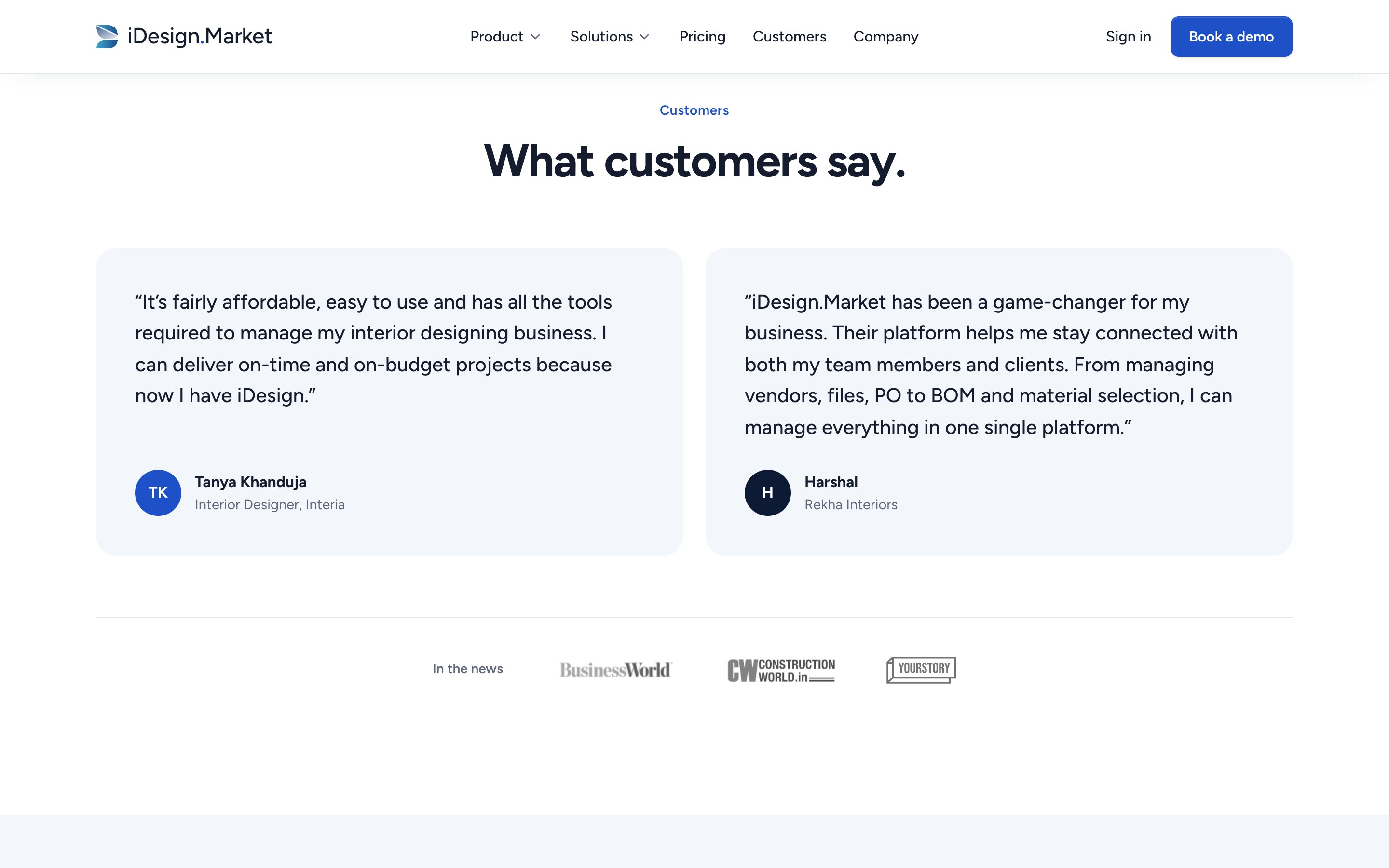
What I did
- Two quotes, each attributed to one person only
- BusinessWorld, Construction World and YourStory logos, linked to the real articles
Why
- Fixes the duplicated-quote problem from the audit; every quote now has exactly one owner
- Independent press is a different kind of proof from customer quotes, so it gets its own row
Pricing
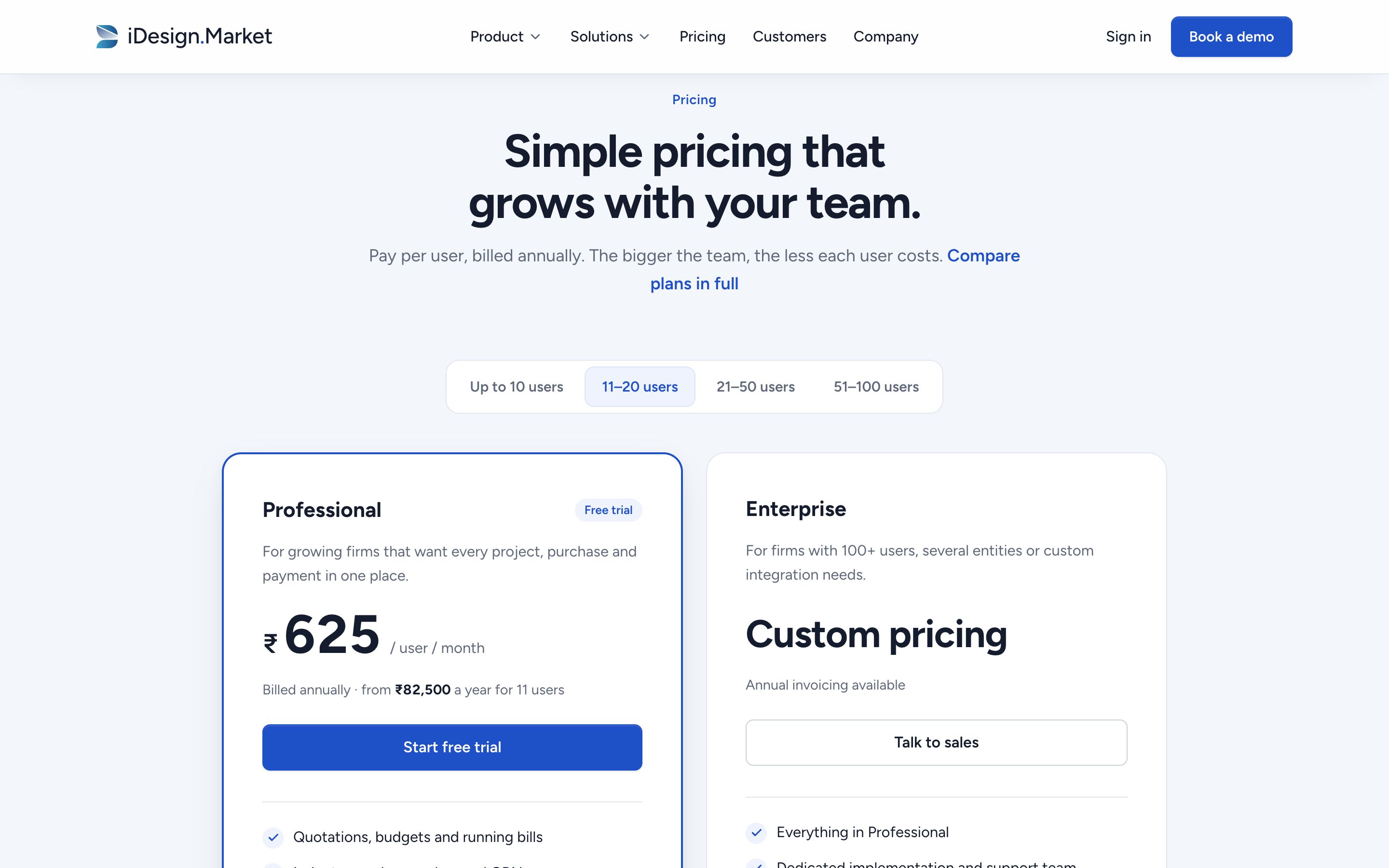
What I did
- Pricing on the homepage instead of behind a link
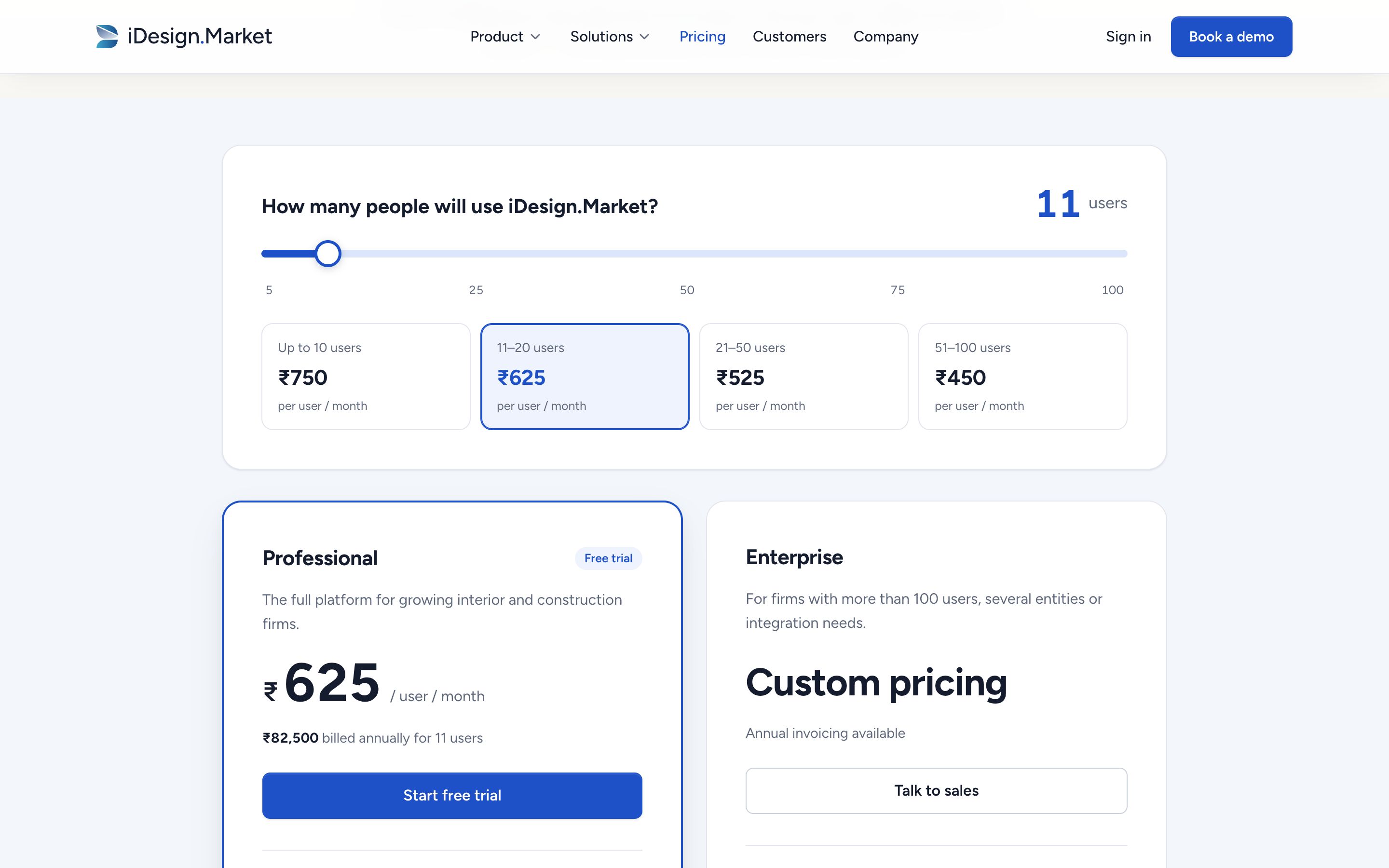
- A team-size selector using iDesign’s real bands: ₹750, ₹625, ₹525 and ₹450 per user per month, billed annually
- The annual total updates instantly, with a short count animation on the price
- Professional and Enterprise side by side, with the same structure
Why
- Published pricing is a competitive advantage; I made it visible
- Showing the total for a realistic team removes the mental maths
- “The bigger the team, the less each user costs” turns the band structure into a benefit
FAQ and demo
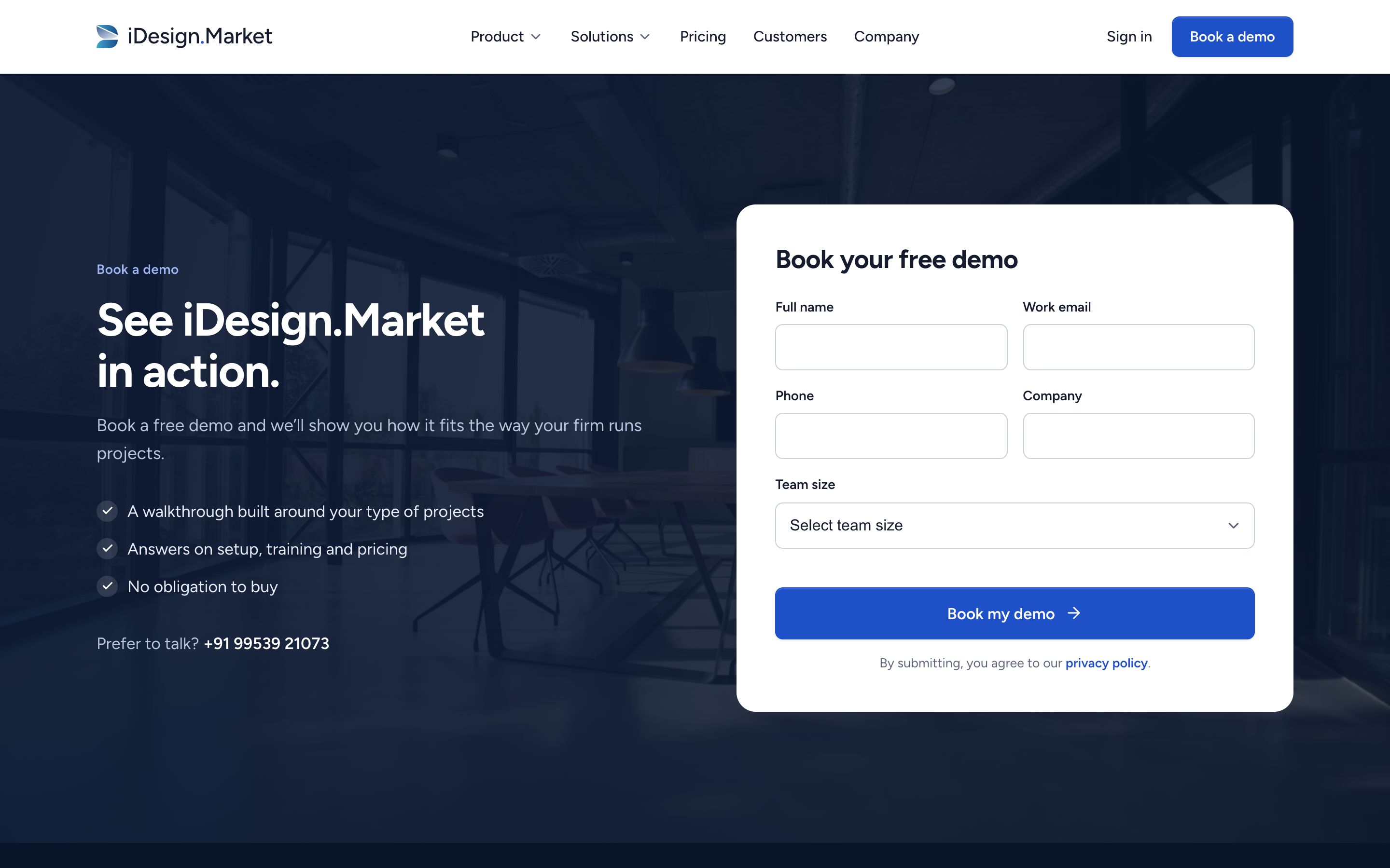
What I did
- Six questions with six different answers, including an honest comparison with Procore, Buildertrend and Studio Designer
- A demo form on the page: five fields, clear labels, inline validation, and a confirmation state
- A phone number for people who would rather talk
Why
- The old FAQ had two identical answers
- Putting the form on the page removes a step
- Error messages say exactly what’s missing, in plain English
On mobile

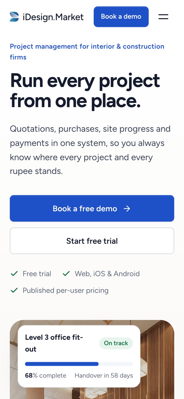
On phones, buttons go full width, the timeline becomes a vertical list, tabs and pricing bands reflow, industry cards swipe, and the hero cards resize so the photo stays visible. No content is hidden on small screens.
Eleven more pages
Every page shares the same header, footer, type, colour, components and product screens, so a visitor doesn’t have to relearn the site.
Shared building blocks
- Page hero: breadcrumb, eyebrow, one headline, one sentence and two actions. Split with a photo on the industry and About pages; centred on Product, Pricing and Contact, where the product or the form is the visual.
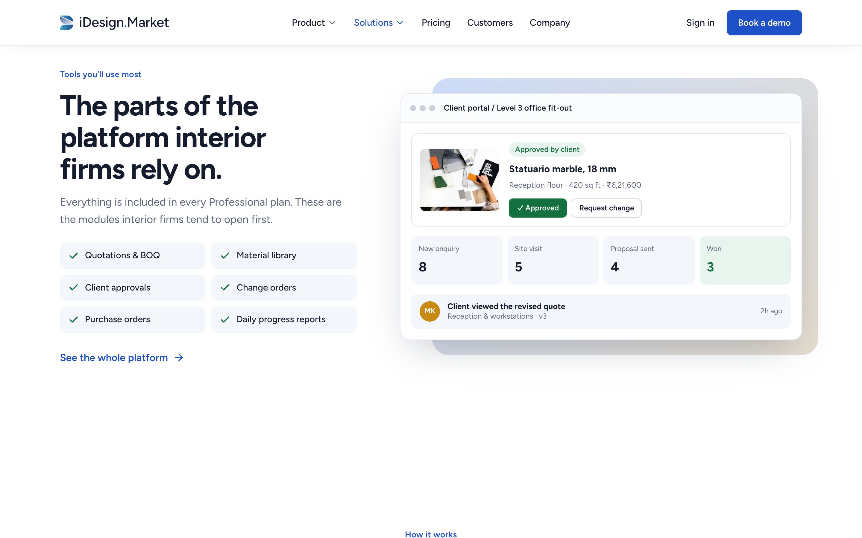
- Product screens: eight HTML screens (timeline, cost, client approval, all projects, drawing register, multi-site dashboard, portfolio budget and store rollout), all using the same sample project data so the story stays consistent from page to page.
- Proof: the customer logo row, three attributed quotes and press logos, reused on each page.
- Closing call to action: the same blue band on every page, leading to the demo form.
Product
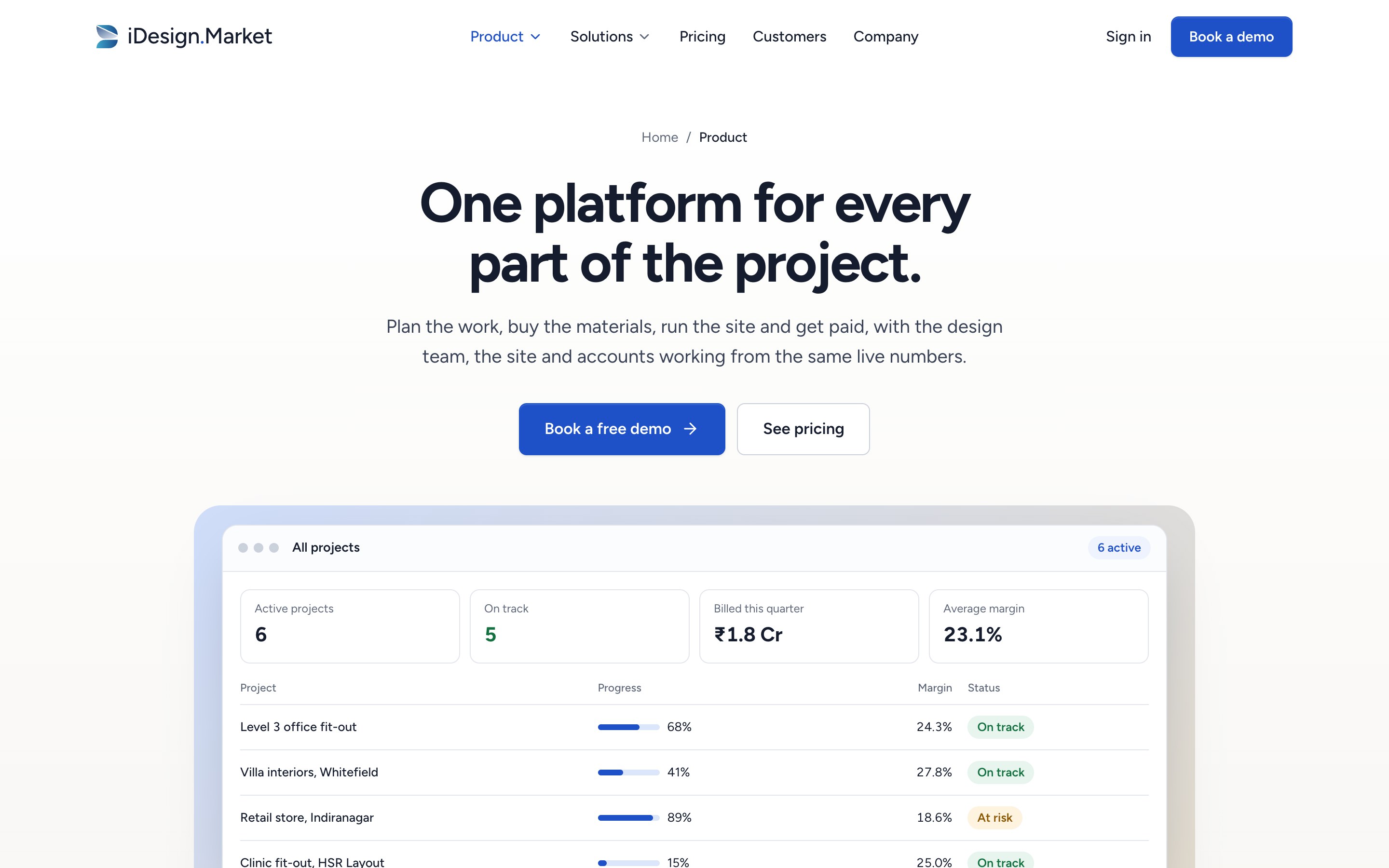
What I did
- Replaced “Features” with a Product page that opens on an all-projects view, the screen an owner uses most
- A sticky in-page menu for the five areas: project, procurement and cost, client, mobile, admin and integrations
- Each area gets a benefit headline, a large product screen, then every feature in plain language
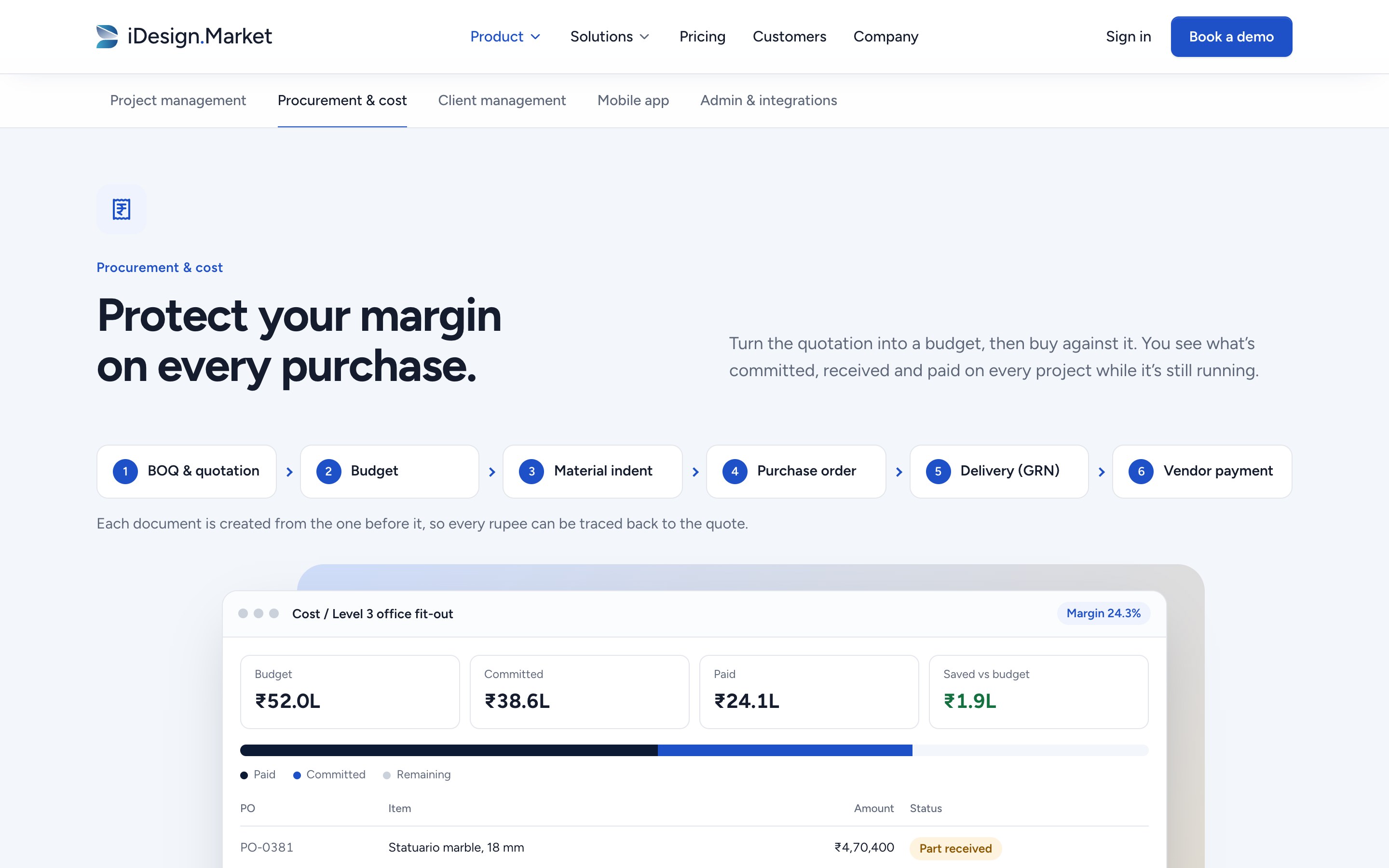
- Procurement shows the six-step money flow (BOQ, budget, indent, PO, delivery, payment) as its own visual
Why
- Owners want to see everything the product does without reading long feature lists
- The sticky menu lets them jump to what they care about and always shows where they are
- Competitors don’t show the money flow, so it gets the largest picture on the page
Pricing
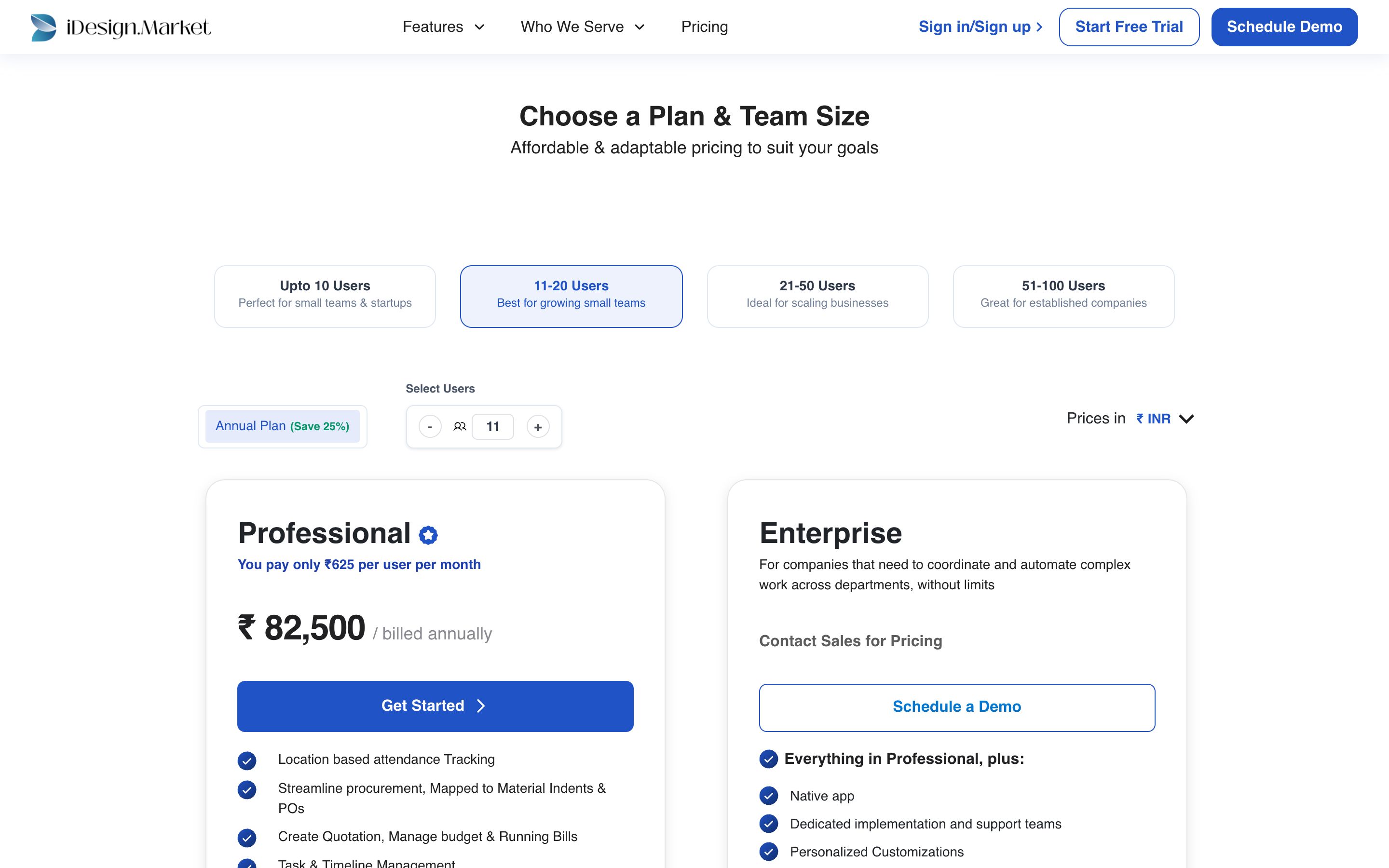
What I did
- One slider from 5 to 100 users; the matching band lights up and the price and annual total update instantly
- Professional and Enterprise side by side, with the same structure
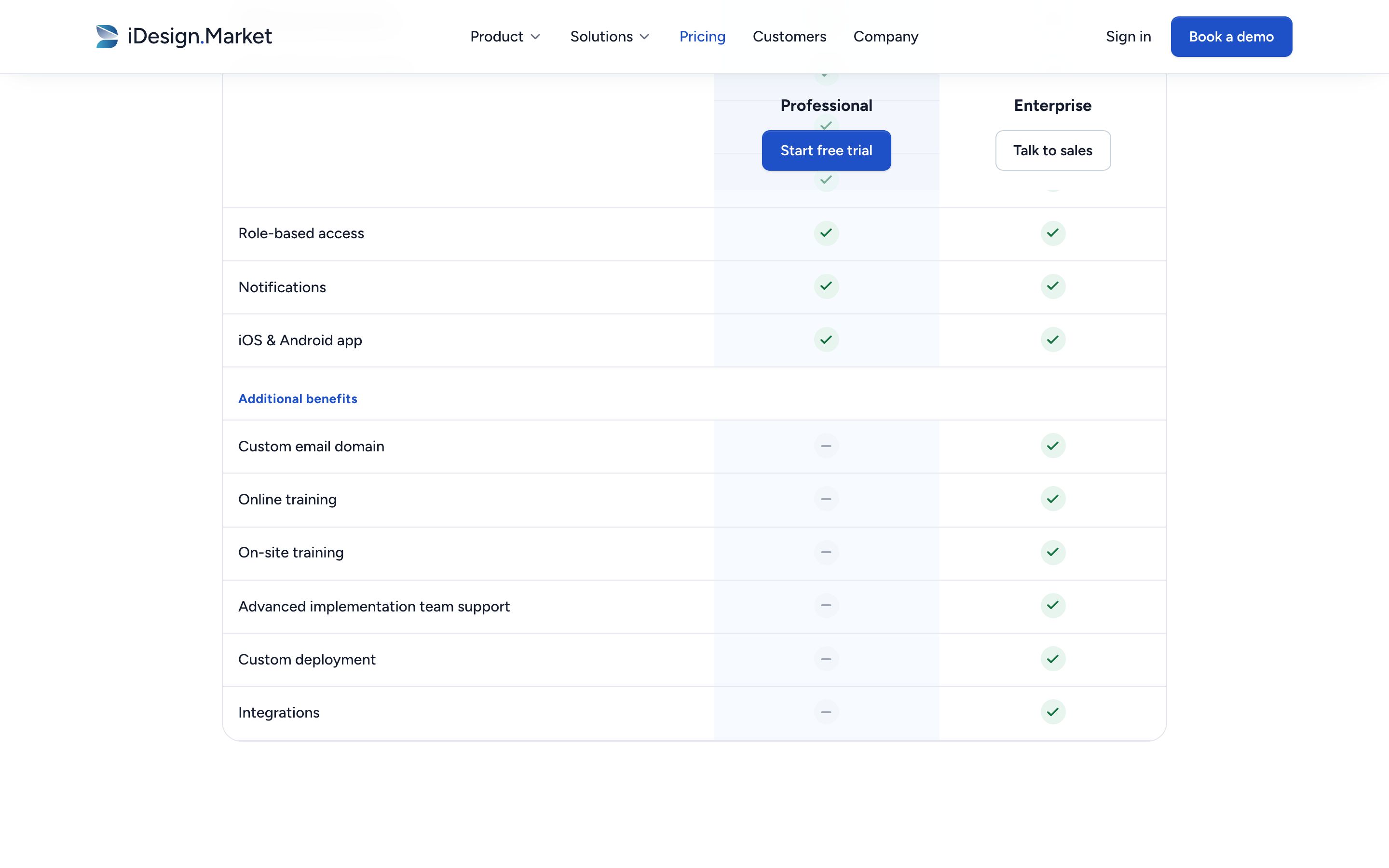
- The full comparison table, with a sticky header so plan names stay in view
- A pricing-only FAQ
Why
- The old page needed a band tab and then a stepper; one control does both
- The table carries iDesign’s real data, including what Professional doesn’t include (training, implementation support, integrations), so nothing surprises a buyer later
- Six answers remove the questions that would otherwise need a call
Industry pages
What I did
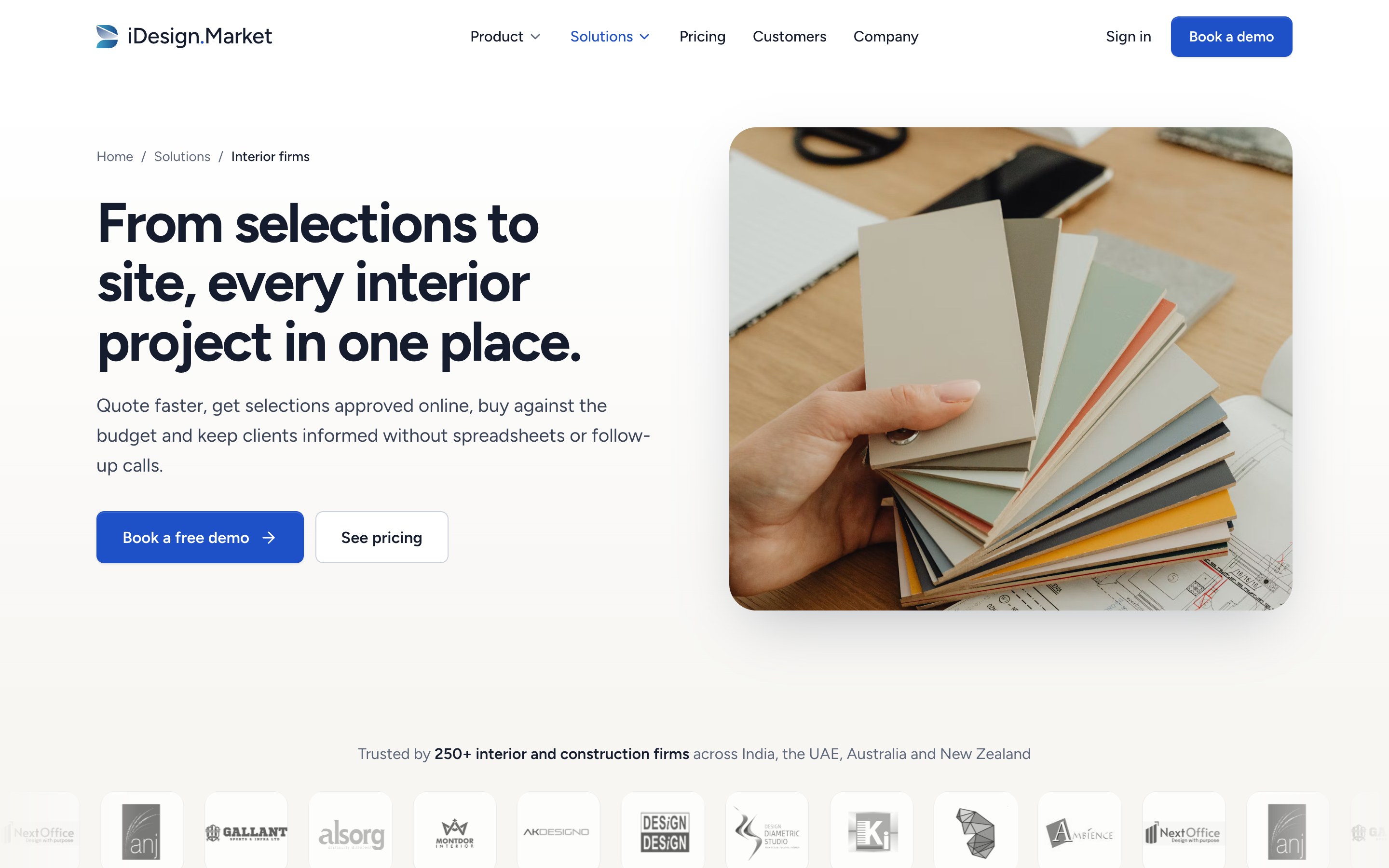
- One template, five pages: interior firms, architects, construction companies, real estate developers and retail chains
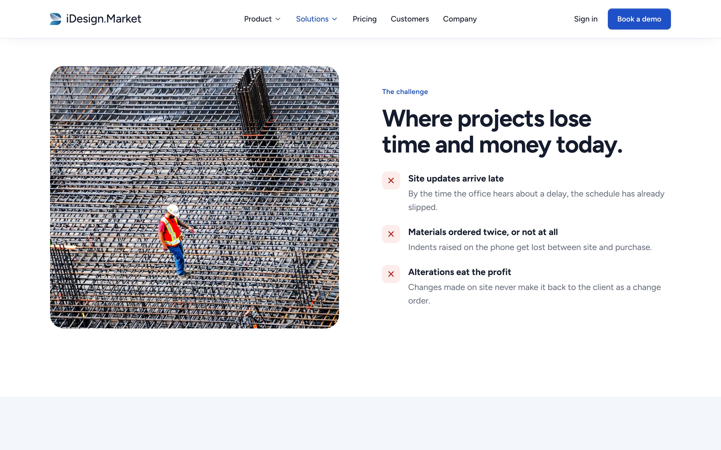
- Each page has its own headline, photography, three industry-specific problems and four to six benefits written from iDesign’s own industry copy
- The six tools that industry opens first, next to a product screen made for it: selection approval, drawing register, multi-site dashboard, portfolio budget or store rollout
- Links to the other four industries before the closing call to action
Why
- Visitors from search and ads want proof, in the first screen, that the product fits their kind of firm
- A shared template keeps quality consistent, while specific copy and screens make each page read as written for that kind of firm
About
What I did
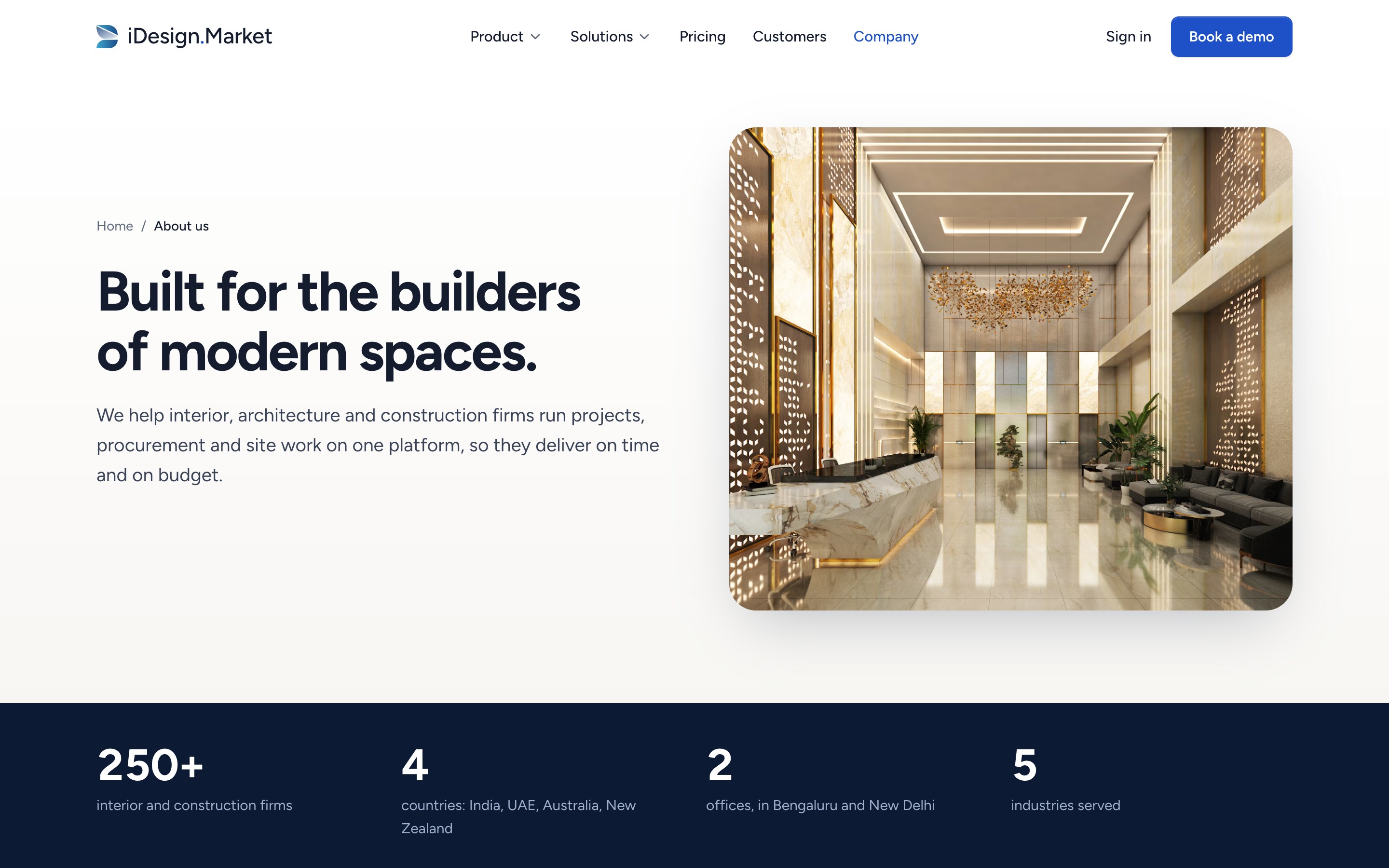
- Kept iDesign’s own line as the headline: “Built for the builders of modern spaces.”
- A facts band: 250+ firms, 4 countries, 2 offices, 5 industries
- The story in three short paragraphs; mission and vision as two cards
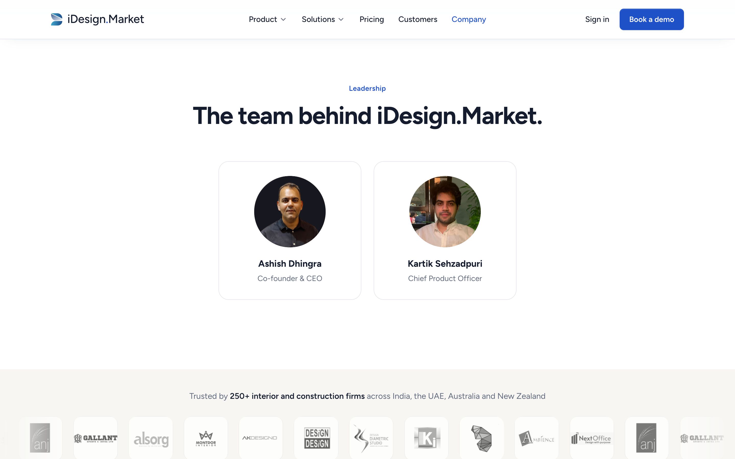
- Leadership with real photos, then customers, Brigade REAP, press and careers
Why
- I kept the story’s text; the stock photo and the dense layout were what undermined it
- The stock photo with another firm’s branding is gone, replaced by a modern interior that isn’t presented as the team
- Numbers and named leaders give a buyer something to check
Contact
What I did
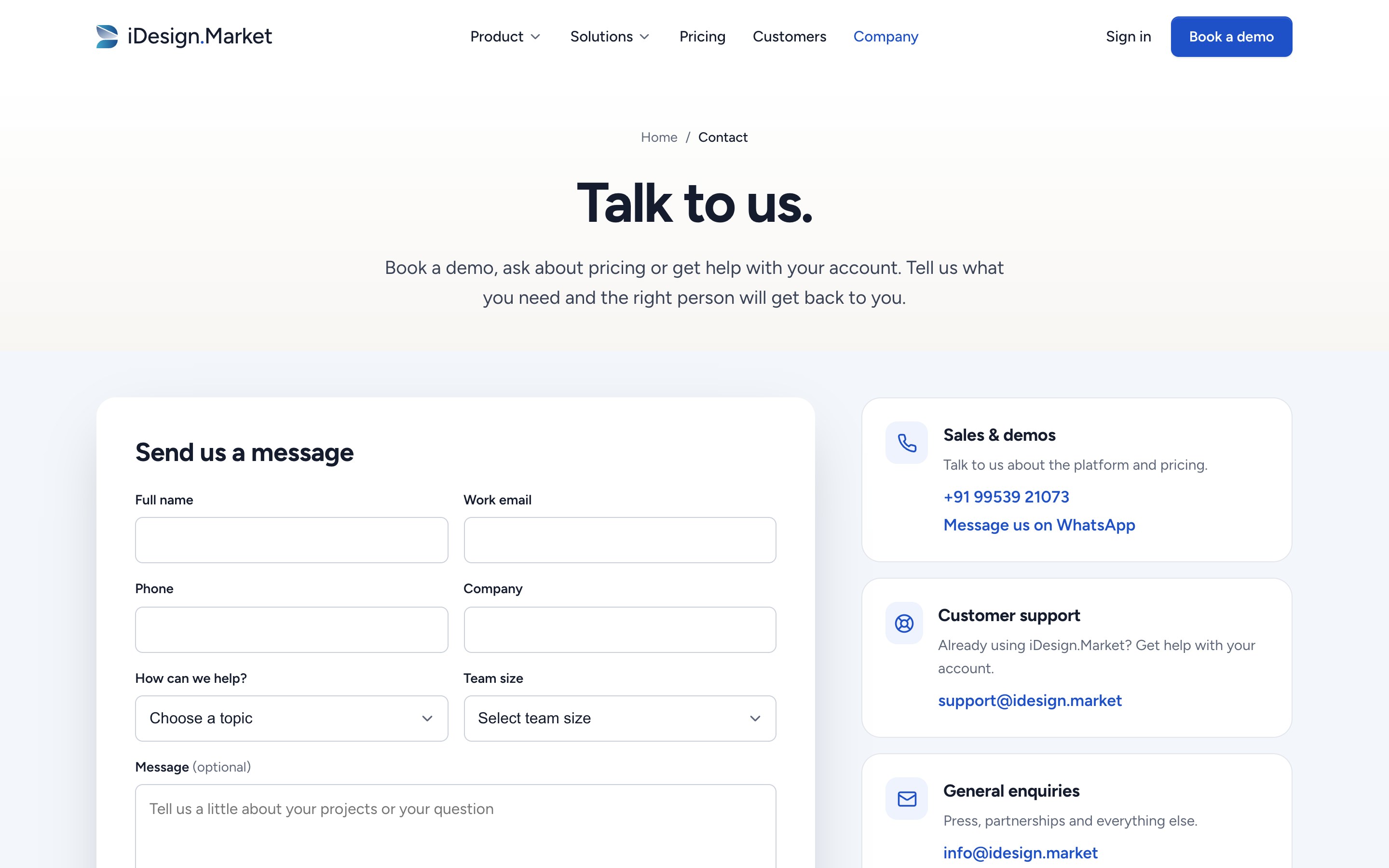
- One form with a topic picker (demo, pricing, support, partnership or other), clear labels and validation
- Three routes beside it: sales and demos (phone and WhatsApp), support, and general enquiries
- Both offices with directions; sign-in and app downloads for existing customers
- Marketing consent is opt-in and in plain words: “Send me product updates on WhatsApp and SMS”
Why
- The old page had no phone number and one email for everything
- Routing by topic gets each enquiry to the right person first time
- Existing customers find support without filling in a sales form
Legal pages
What I did
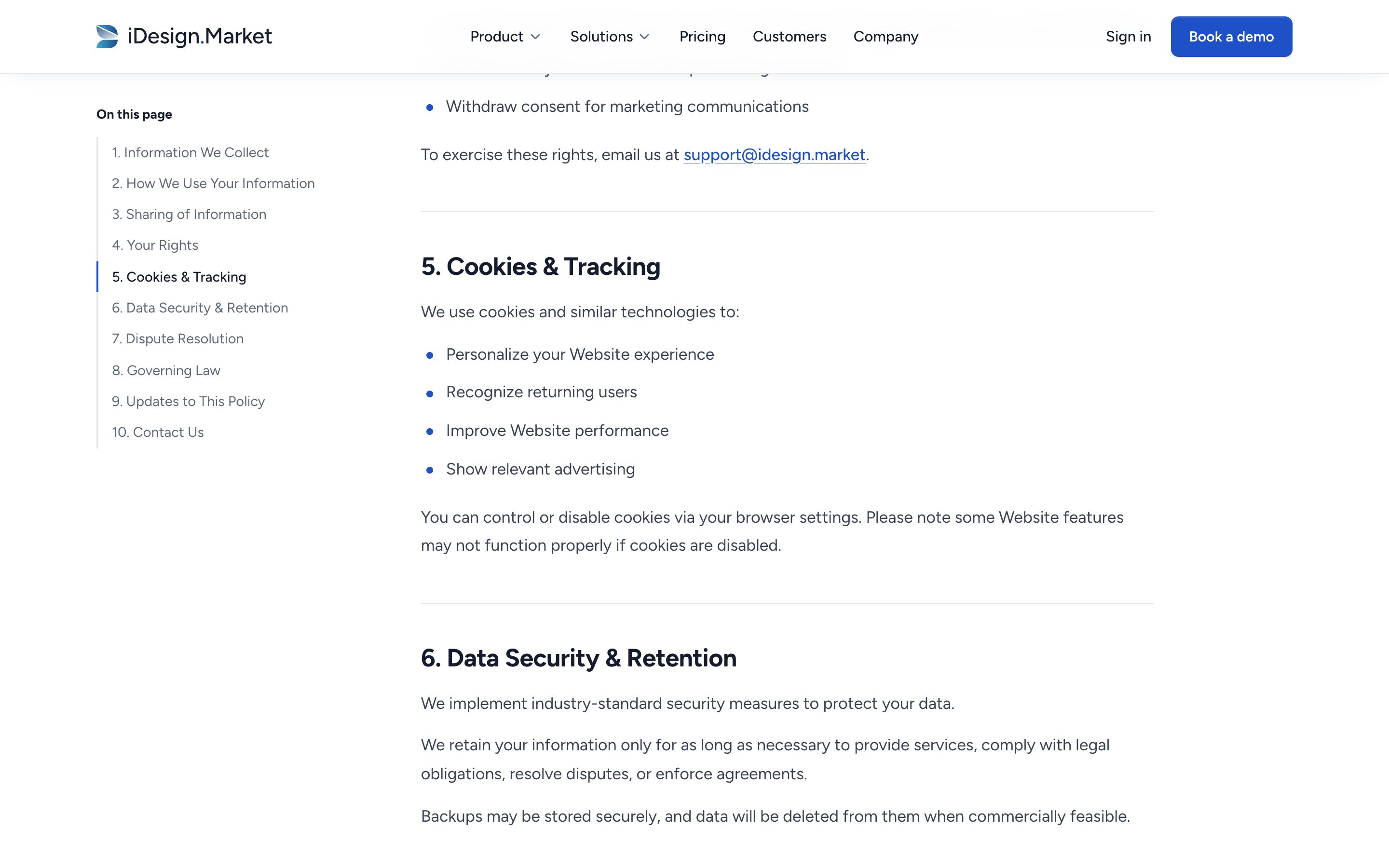
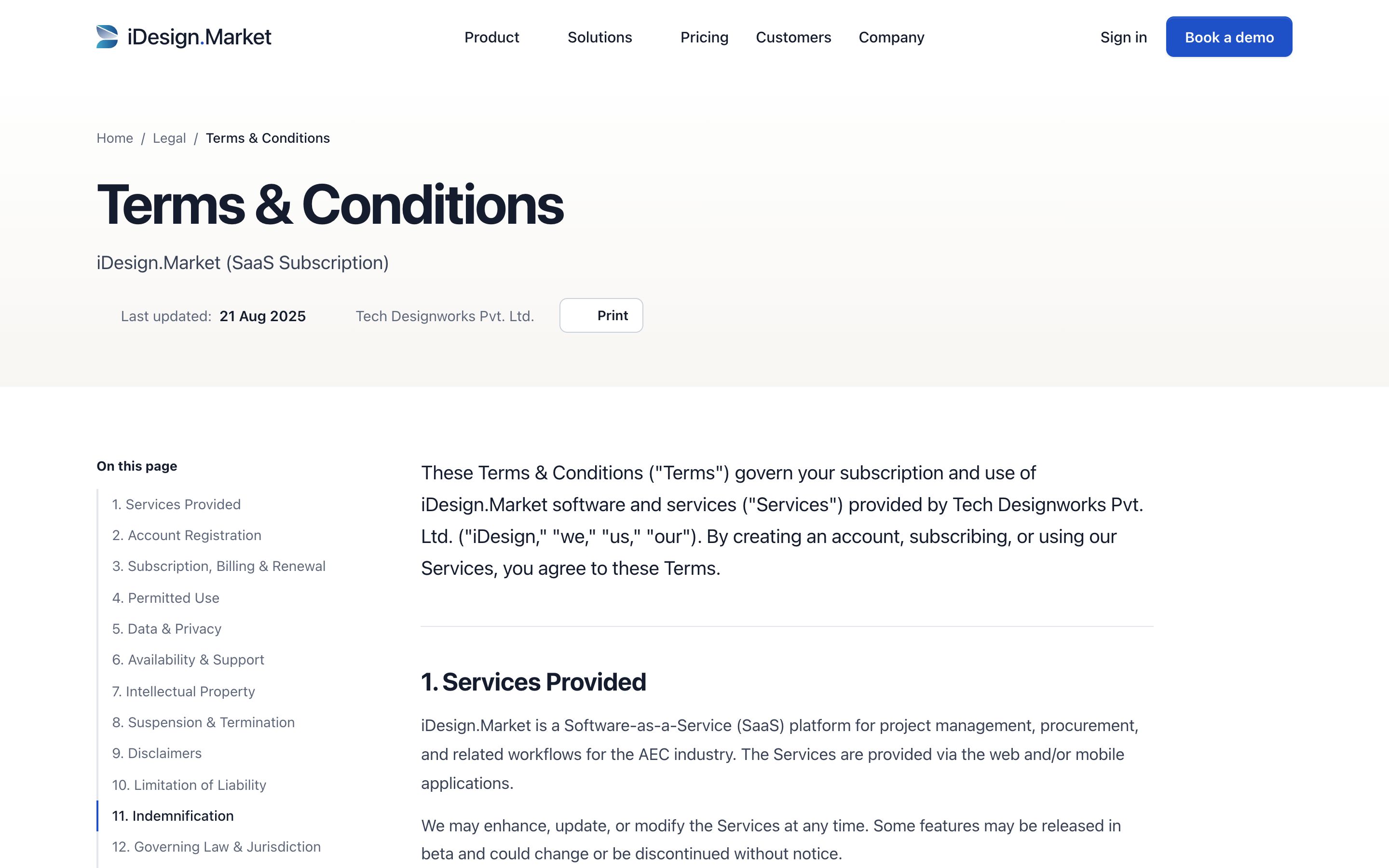
- One legal template for the Privacy Policy and the Terms & Conditions
- The date and company up front, plus a print button
- A contents list that stays in view on desktop and highlights the section you’re reading; on mobile it starts collapsed
- Left-aligned text at a comfortable line length, real headings, and clear lists
- A help box and a link to the other document at the end; a clean printed version without the site’s navigation
- The terms published under their real name, with the footer offering Privacy policy, Terms & conditions, and Cookies (which jumps to the privacy policy’s cookie section)
Why
- People read legal pages before signing up or when something has gone wrong, so they should be easy to read
- Justified text and a wall of sections made the old pages hard to scan
- The wording stays exactly as it was; only the design changed
Motion
What moves on the site, and why. The product screens move to show cause and effect.
Principles
- Cause and effect. A bar fills because progress happened, and an approval resolves because the client acted. Anything that doesn’t explain something stays still.
- One easing curve. cubic-bezier(.16, 1, .3, 1) across the site, 200–500ms for interface and up to 1.2s for large reveals.
- Reading first. Nothing blocks reading, takes over the scroll or loops where it would distract.
- Reduced motion. With “reduce motion” switched on, everything appears in its final state.
| Interaction | Behaviour | Purpose |
|---|---|---|
| Hero entrance | Text rises in sequence; the photo opens from an inset frame; three product cards arrive one by one, then drift gently | Promise first, then the product |
| Counters | 68%, 24.3% and the customer facts count up when first seen | Draws attention to the key numbers |
| Logo row | Slow continuous scroll; pauses on hover; logos colour on hover | Shows breadth of customers without a wall of logos |
| Section reveals | Content fades and rises 24px as it enters, with small staggers | Marks where each section starts |
| Tabs | A navy indicator slides to the selected tab; the panel fades up; product bars fill | Makes switching feel direct and shows the product reacting |
| Client approval | “Awaiting approval” becomes “Approved by client” after a short pause | Shows the client portal working |
| How it works | The connecting line fills with scroll; steps turn blue as they’re reached | Shows the whole flow as you scroll |
| Mobile app | Report button turns to “Submitted ✓”, then “Timeline updated” appears | Shows the site-to-office link in two beats |
| Cards | Lift 4px with a deeper shadow; photos zoom 6%; arrows nudge | Signals what’s clickable |
| Pricing | Indicator slides between bands; the price counts to its new value | Makes the price change easy to see |
| FAQ | Answers open and close with a smooth height animation; the plus turns to a minus | Keeps place and context when reading |
| Form | Focus ring; invalid fields turn red with a specific message; success icon pops in | Tells people clearly what to fix, or that it worked |
| Buttons | Darken, lift their shadow, arrow moves 3px | Makes every button look clickable in the same way |
| In-page menu | Sticks under the header on the Product page; the current area is underlined as you scroll | Shows where you are on a long page and lets you jump |
| Pricing slider | The matching band lights up; price and annual total update as you drag | Gives the price for your team size directly |
| Comparison table | Plan names stay pinned while you scroll the features | Keeps the plan names in view |
Demo requests
If the site launches, the plan is to compare demo requests against a two-week baseline at 30, 60 and 90 days after launch.
| Metric | What it shows |
|---|---|
| Demo requests per 1,000 visits | The primary measure: is the page doing its one job? |
| Demo form completion rate | Whether putting the form on the page gets more people to finish it |
| Scroll depth to the platform tabs and to pricing | Whether people read past the hero |
| Tab and pricing-band interactions | Which product areas and team sizes draw interest, which helps sales |
| Mobile bounce rate | Whether phone visitors stay past the first screen |
| Pricing slider use and plan clicks | Which team sizes are shopping, and whether published pricing shortens the sales cycle |
| Industry page to demo, by industry | Which segments the new pages convert best, and where to invest in case studies |
| Contact form topics | How demand splits between new business, support and partnerships |
| Demo-to-customer rate | Whether the new copy brings leads that fit better |
The first test I’d run: the new headline against a margin-led alternative (“Know your margin before the project ends.”) to see which promise this audience responds to.
What comes next
With the core pages in place, the next steps I’d recommend are a library of customer stories built around real project photography, a deeper page for each product area, a cookie policy once counsel has written one, and moving the content into a CMS so the marketing team can publish without a developer.